- Project type: Client project (within General Assembly’s scheme)
- Participants: Meera Rao, Daniel Green, Irene Alegre
- Duration: 2 weeks
- Tools: Pen and paper, Omnigraffle, Sketch, White walls, Invision
- Methodologies: User interviews, user testing, branding, design studio, sketching, prototyping, persona creation, user flows
The Brief
Chippin enables online merchants to allow their customers to easily and securely share the cost of an online purchase. Therefore, Chippin functions as a payment gateway and increases the chances of users finishing their payment transactions.
The objective
To review the user journey from landing to payments and make this as simple and intuitive as possible while ensuring there is enough information for the user to complete the transaction.
Research
The competition
Glide, Splitit and Make It Social are among our competitors. Looking at their business propositions, the following stood out:
- Chippin’s proposition is unique in the marketplace
- Competitor business models include fundraising, payment gateways and bill splitting
- Most competitors need customer login
User reviews
“Great concept. I hate chasing people for money!”
“Quick Stripe payment is great”
“I like that it has just a few steps”
Assessing the current platform: User experiences and feedback
Once we started testing the current flow with real users (see below), we quickly realised it was an emotional rollercoaster; there were a lot of ups and downs, and adding contributors was frustrating. Users also had issues with the site’s level of trustworthiness, were not aware of the brand and were unsure as to how secure the process was. We have also listed some of the feedback we received on several of the current site’s features.
After a few user interviews and testings it became clear to us that there four main themes we would be focusing on during the following two weeks:
- Education
- Visuals
- Layout
- Security
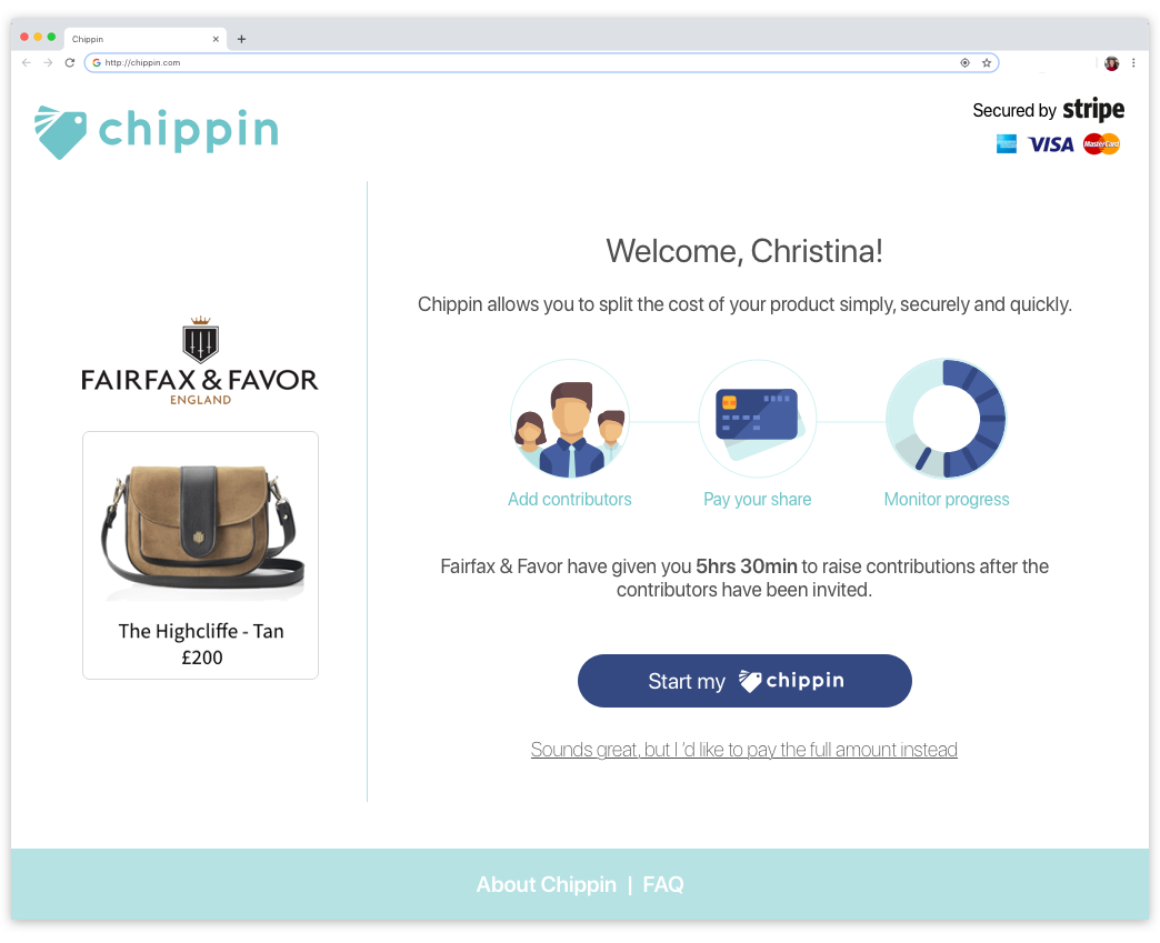
The Welcome Screen
The Welcome Screen was probably the most complex one of the bunch, as we had to get the educational and trust pieces right without overwhelming the user or cramming it up with information. The page had to also include information on the product that’s going to be purchased and create continuity from the previous screen, which is the merchant’s checkout screen.
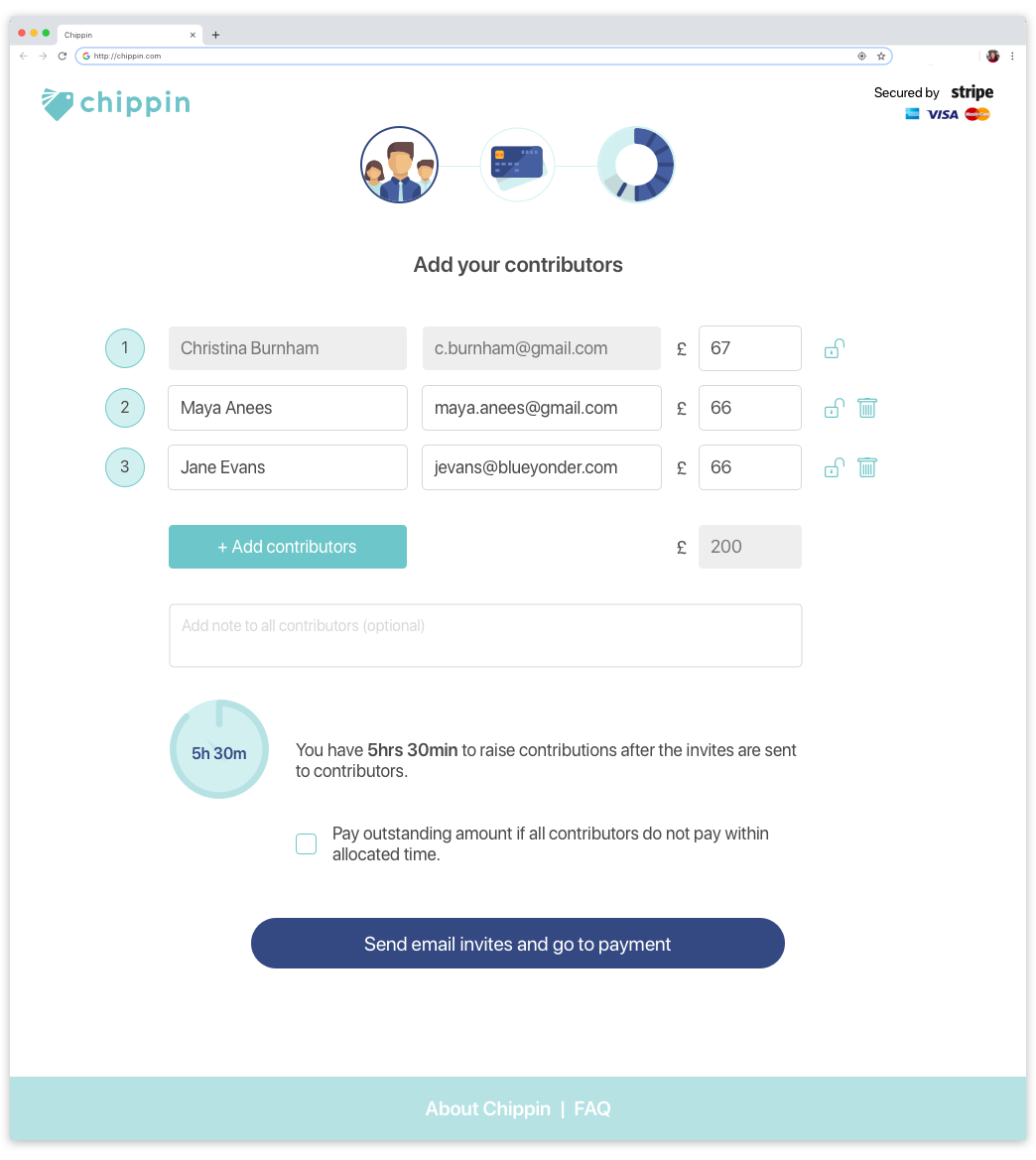
Adding the contributors
The problem with the contributors page was that there was too much going on and too many decisions to be made (for the user, as well as for us). We ended up simplifying it and making it as straightforward as possible.
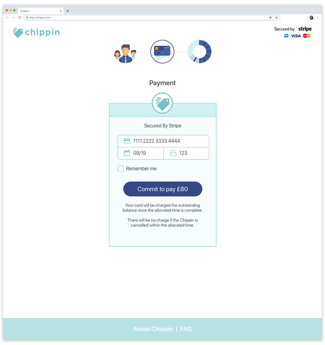
Payment and tracking
We used Stripe’s interface to design the Payment Screen. As a final step, we had to also think of how the user would be tracking incoming payments from the different contributors. We decided to create a unique URL for each tracker, which would be accessed from the confirmation email sent to the user. That way we didn’t require a returning user to create an account with us.
![]()
Next Steps
-
The need for someone’s email might add an extra layer of friction. An integration with Facebook would help users interact through an alternative channel.
-
The underwriting tick box could actually be mistaken for a T&Cs check box, which could cause users to agree without understanding this feature.
-
The new flow does not include any feedback for when things go wrong (e.g. when users don’t lock the amounts).