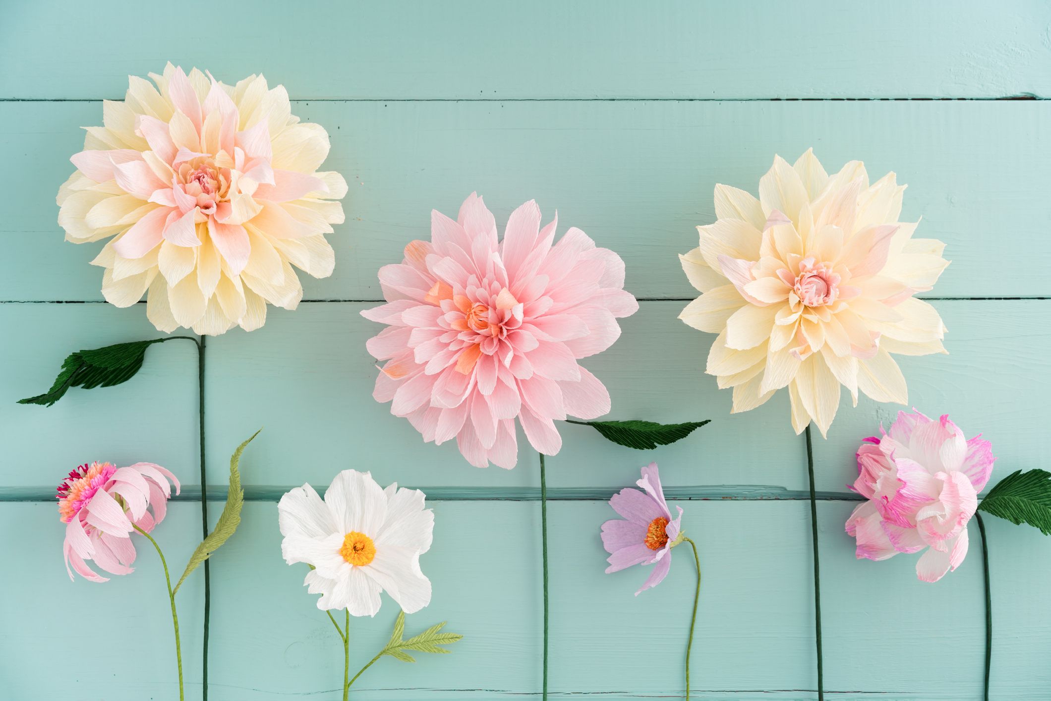
I was in the park the other day and, suddenly, I noticed how beautiful the flowers were. I mean, it’s not like I’d never noticed the beauty of flowers before, but this time around I also realised that there are no flowers in ugly colours. Really. Even in flowers that are considered ugly, the colours are themselves beautiful.
What constitutes an ugly colour, though?
Well, you may be thinking that beauty is in the eye of the beholder, and that whether a colour is ugly or not is entirely subjective. And I agree. But I also don’t. Just like humans show a preference for symmetry or clear lines, I would argue that we also have a strong preference for clean colours.
So, what makes a colour clean? I would start by defining what makes a colour not clean. A colour that is not clean - or a colour that is dirty or muddy - is one that is desaturated, often because it’s got some grey undertones in it.
While we can find desaturated colours in nature - tree trunks are a good example -, when it comes to flowers they tend to have brighter colours. Even in pastels, where there is a fair amount of white, the petals remain bright and vivid. This is so that they attract other animal species such as bees.
How does that impact my design?
I tend to gravitate towards pure or clean colours anyway because it’s a personal preference of mine, and I do dislike desaturated colours in fabrics, furniture and even vegetables and fruit, but I do know people who have a different preference. Regardless of personal taste, however, I’m proposing that designs might benefit from cleaner palettes that are naturally - hehe - pleasant to the eye. Why not take inspiration from nature the next time you’re defining your colour palette?