Context
JOOR is a wholesale fashion platform that connects Brands (who sell products) and Retailers (who purchase products in bulk). Retailers can place orders with Brands once they are “connected” on the platform. About 50% of all orders across JOOR platforms are created using the iPad app, which operates offline to ensure seamless functionality regardless of internet connectivity. Orders created offline can later be synced to the web.
Problem
One major pain point for users of the JOOR iPad app was the length of time it took to start the order creation process, especially when working with new customers. To create an order with a new customer, the app required users to:
- Create a new customer profile with mandatory fields, including shipping and billing addresses.
- Provide the same information again at Checkout, even if the user wasn’t ready to submit it.
These requirements often led users to input placeholder or gibberish information just to proceed, creating downstream issues like data inaccuracies and inefficiencies. Entering data using an iPad keyboard was also frustrating and inefficient. Additionally, these strict requirements were particularly frustrating when users simply wanted to begin creating orders quickly and finalize details later.
Solution
I proposed a series of changes to streamline the order creation process while balancing the needs of users who preferred collecting customer information early. The solution focused on:
- Making the address fields optional during customer profile creation.
- Allowing order submission without shipping or billing addresses for orders in specific statuses, such as “note” or “pending.”
- Updating and redesigning key areas of the app to improve usability and align with iOS design standards, focusing on the customer creation process and the Checkout screen.
- Moving the order status dropdown from the Cart Review screen to the Checkout screen to simplify workflows and reduce user friction.
Key Changes
1. Updating the Checking Screen
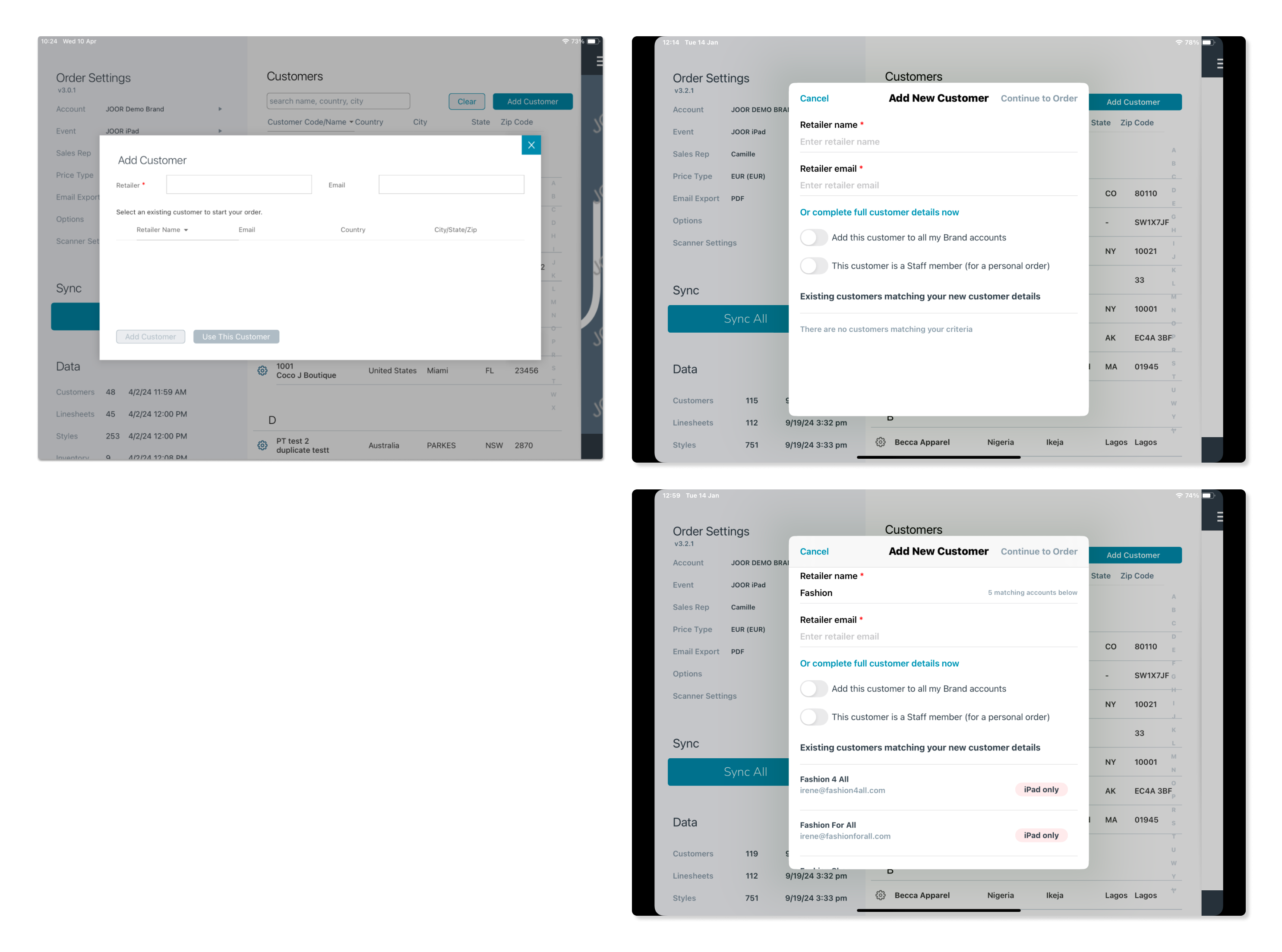
The checking screen is used to:
- Capture the retailer’s name and email address.
- Prevent duplication by checking whether the retailer already exists in the local database.
The original UI for this screen was unintuitive and inconsistent with iOS design patterns. I redesigned the screen following Apple’s Human Interface Guidelines, making it easier for users to identify duplicate profiles and proceed efficiently.
2. Improving the New Customer Form
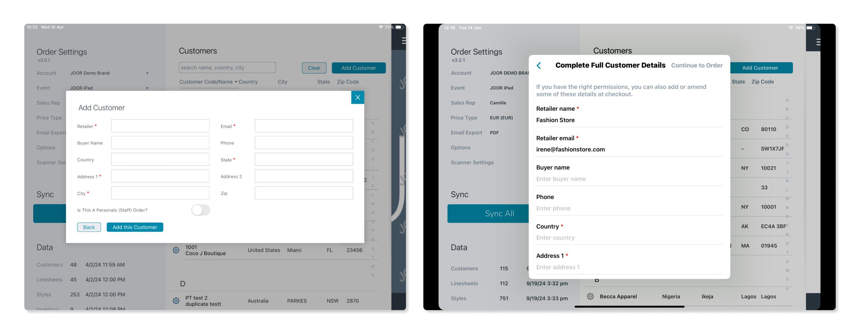
The new customer form was updated to provide a smoother experience:
- The UI was redesigned to be more user-friendly and intuitive.
- Adding contact details for a new customer profile became optional, allowing users to skip this step if they preferred to proceed directly to order creation.
3. Moving the Order Status Dropdown
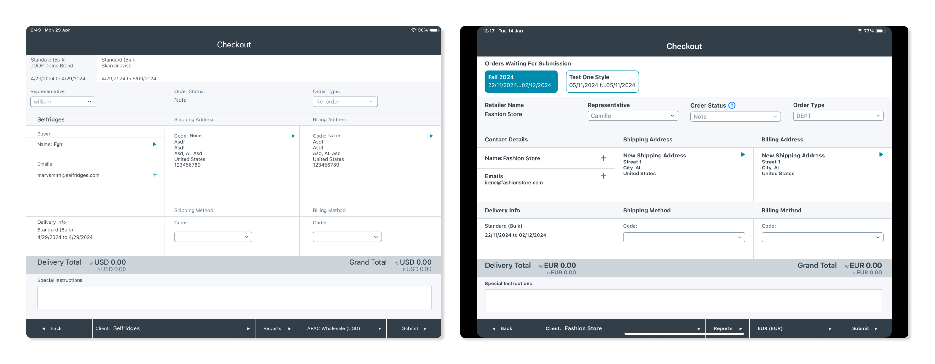
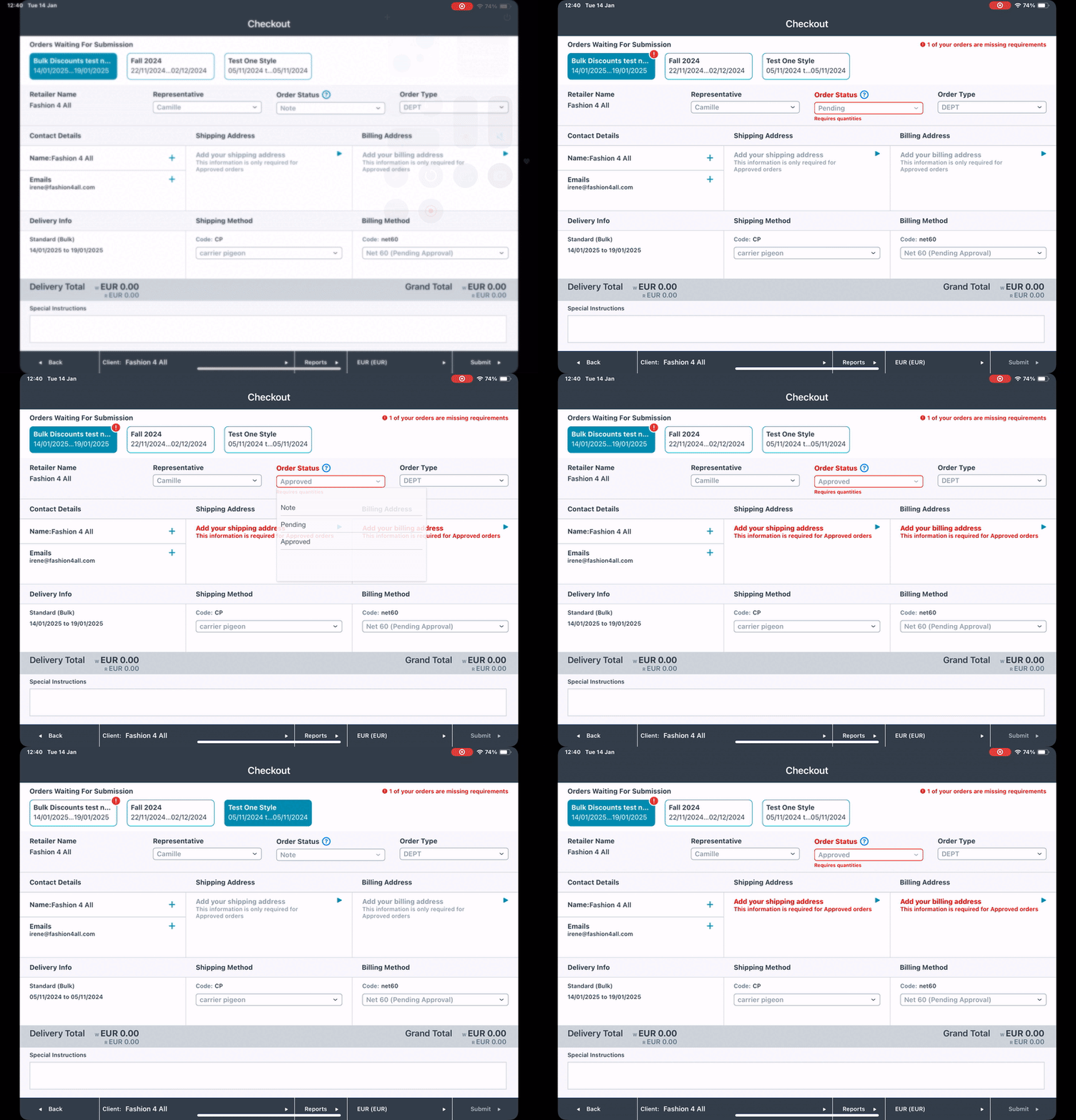
The order status dropdown was relocated from the Cart screen to the Checkout screen. This aligned all order-related information in one place, simplifying the workflow and ensuring immediate feedback on address requirements.
4. Enhancing the Checkout Screen
Key improvements to the Checkout screen included:
- Realigned Elements: Improved layout for better scannability.
- Carousel UI: Redesigned the top carousel for clarity and better usability.
- Empty States: Added contextual empty states to guide users on required and optional information.
Research and Validation
I conducted multiple rounds of testing and feedback sessions:
- Unmoderated Testing with Maze: Gathered data on usability and pain points for the new checking screen.
- 1:1 Customer Sessions: Validated designs directly with users from discovery research.
- Internal Feedback: Collaborated with Customer Success Managers to incorporate their insights into user behavior.
Implementation
Adding a New Customer
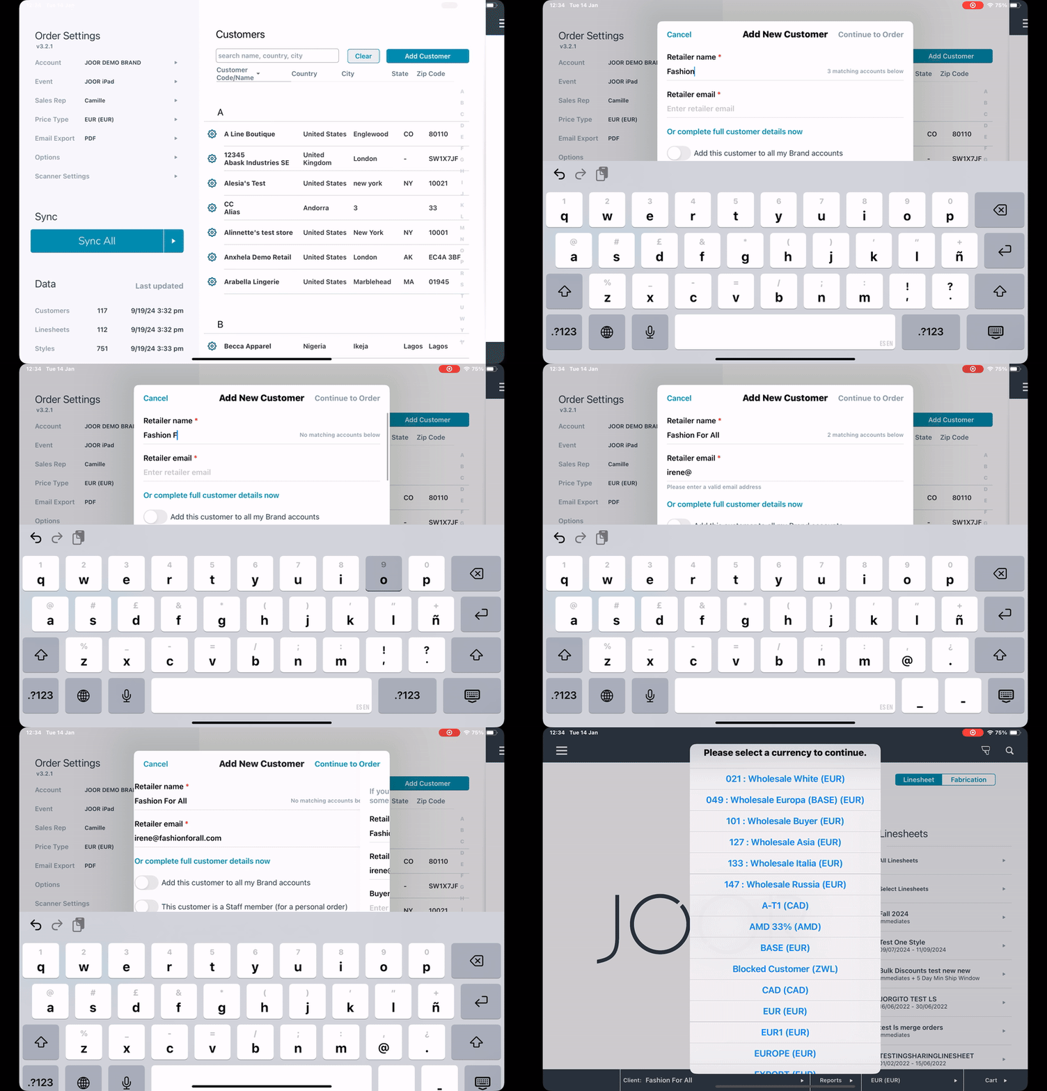
The updated flow for adding a new customer includes improved feedback on matches, an enhanced modal design, and optional contact details.
Reviewing Customer Information and Changing Order Status
The updated UI for the Checkout screen features realigned elements, error feedback, and the relocated order status dropdown.
Outcome
Although the new designs have just been implemented, initial results are promising:
- The time to create an order for new customers has been halved.
- A decrease in duplicate retailer profiles is expected due to the improved checking screen.
- Order submissions are likely to increase with the streamlined flow.
Reflection
This project highlighted the importance of balancing user needs with business requirements. By iterating on designs and incorporating feedback, I delivered a solution that improved usability and aligned with diverse workflows, empowering users to create and manage orders more efficiently.