Overview
JOOR is a wholesale fashion platform connecting Brands (sellers) with Retailers (bulk purchasers). Retailers can place orders with Brands after establishing a “connection” on the platform. The iPad app plays a critical role in JOOR’s operations, generating around 50% of all orders across platforms.
Identifying Problems
Customer interviews at the start of the year revealed several pain points with the iPad app’s Customer List functionality:
-
Accessing the Customer List
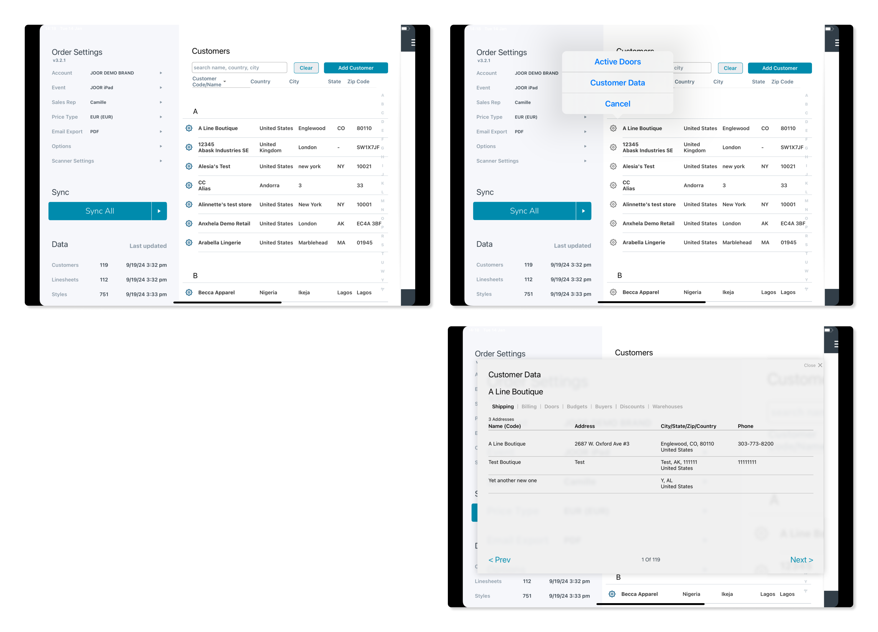
Users wanted to access the Customer List from anywhere in the order creation flow. Although technically possible, the UI lacked clear signposting, leaving this feature underutilized. -
Viewing Customer Information
While customer details were viewable, the feature was hidden behind a gear icon, making it nearly invisible—even to users familiar with the app. Every person shown this feature expressed surprise and admitted they didn’t know it existed. -
Editing Customer Information
Users were unable to edit customer details (e.g., addresses or buyer names) directly from the Customer List. They had to create an order first and then make changes at Checkout, which was inefficient for users wanting to update information without starting a new order. -
Customer Duplication
The UI prioritized creating new customers over searching the existing list, leading to duplicate profiles. This issue stemmed from the ‘Add Customer’ button being more visually prominent than the search box. -
Customer Syncing Issues
The offline-first approach required manual syncing of customer data. Users often couldn’t find customers during appointments due to unsynced information. This approach, logical in 2012 when the app launched (due to unreliable venue Wi-Fi), was less relevant in 2024, as most iPad users were consistently online.
Proposed Solutions
UI Redesign
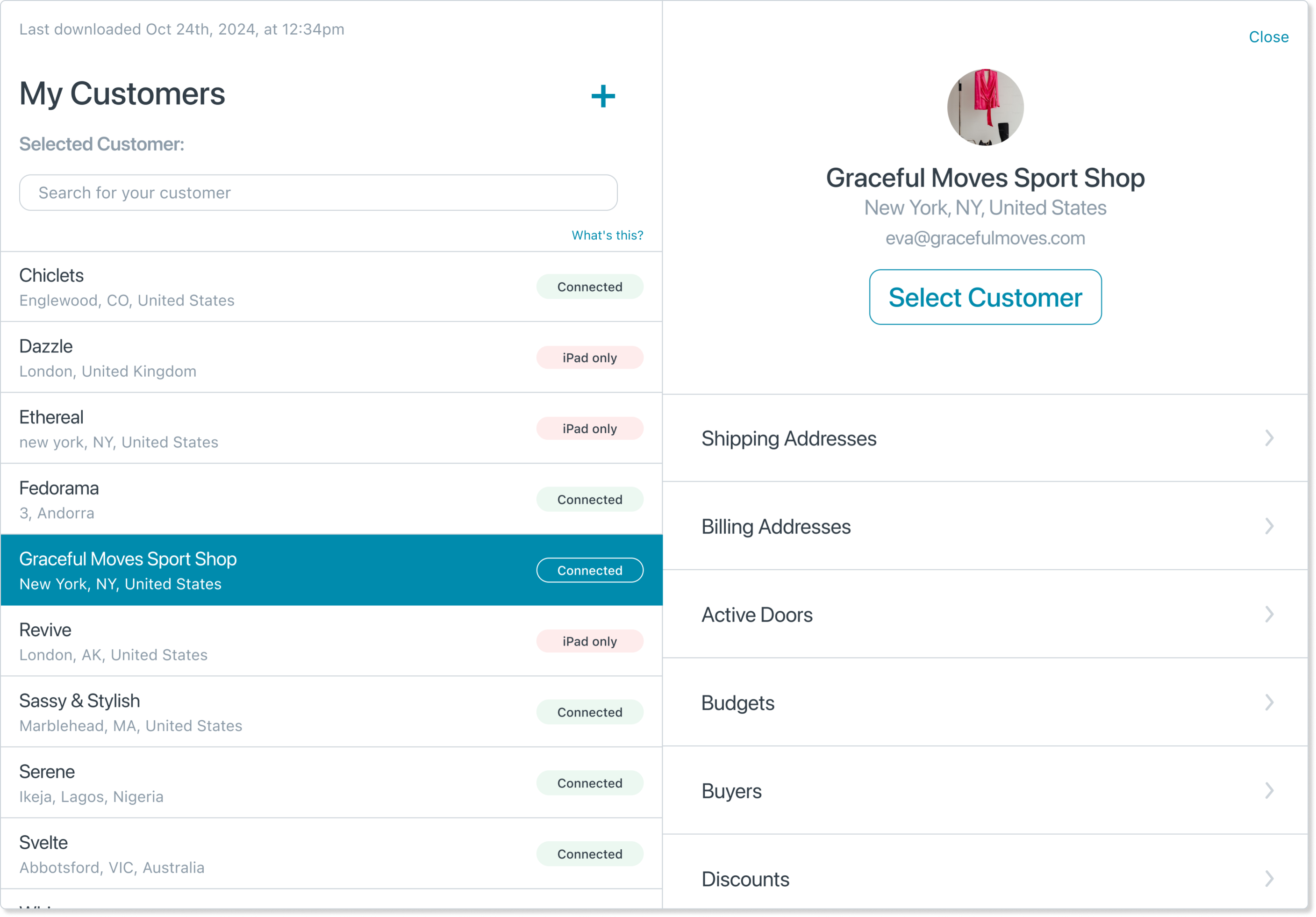
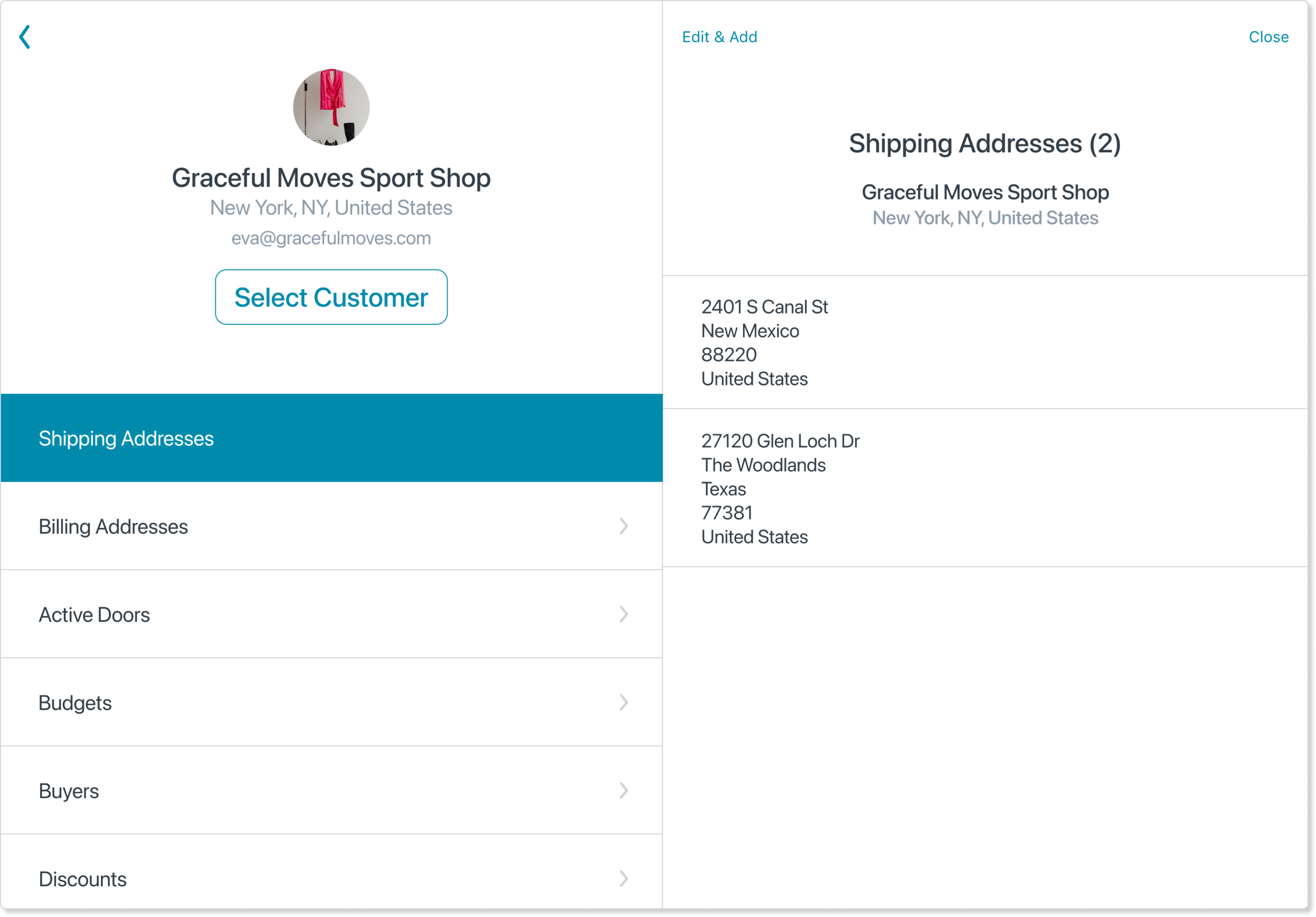
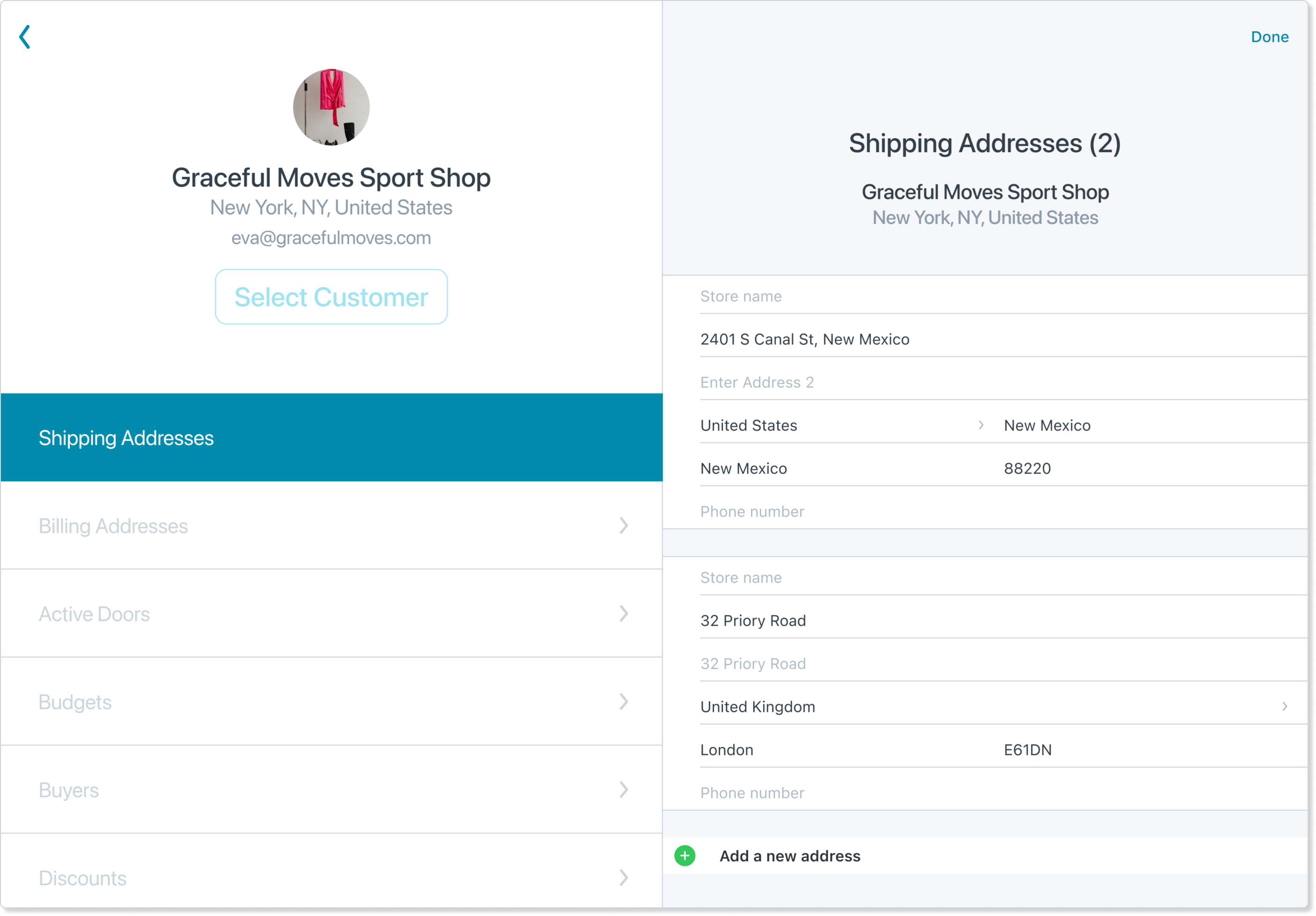
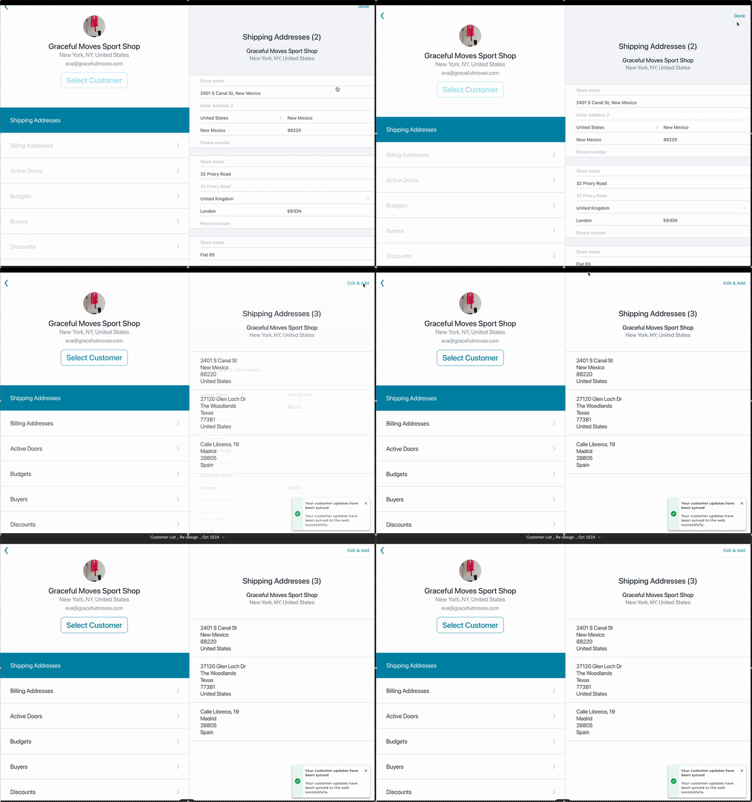
With the engineering team rebuilding the Customer List screen from scratch, we seized the opportunity to redesign it. Inspired by the iPad’s Contacts app, the new design positioned the Customer List as a contact management tool, allowing users to:
- Search and browse customers.
- View detailed customer information.
- Edit customer details directly.
- Initiate order creation for selected customers.
Enhanced Syncing Mechanism
Taking advantage of improved iPad internet connectivity, the redesign introduced:
- Automatic Syncing: Customer data synced automatically when accessed online.
- Push Updates: Changes made on the iPad automatically updated the web platform.
- Notifications: Clear notifications indicated successful or failed syncs.
User-Centered Navigation
While a full navigation overhaul was planned for the future, immediate improvements focused on:
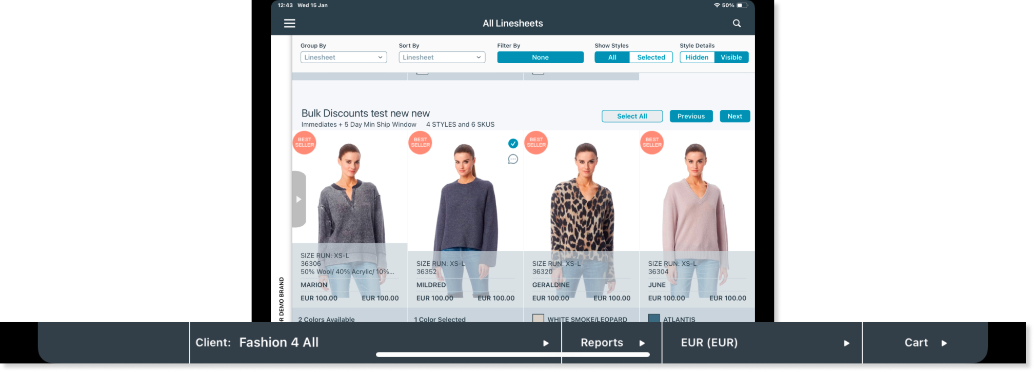
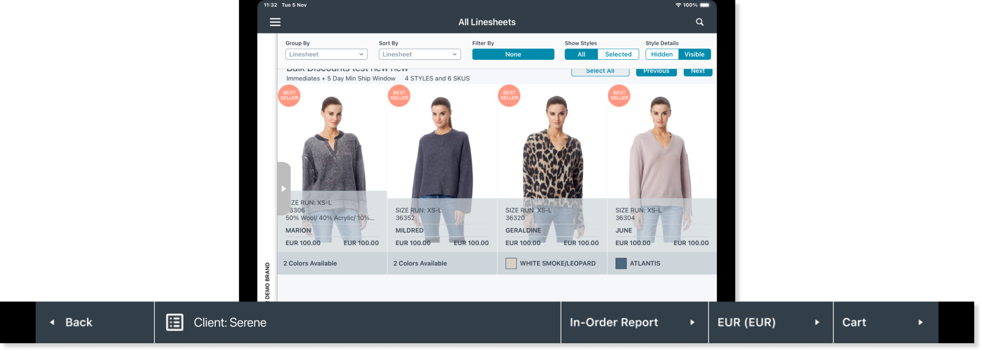
- Footer Adjustments: Updated to clarify functionality with minimal changes.
- Order Creation Flow Integration: The Customer List remained integrated into the order creation flow, with plans to eventually separate these processes while maintaining their relationship. Users could access the Customer List when starting an order or initiate an order from the list itself.
Collaborative Design Process
The redesign was a collaborative effort involving:
- Product Manager: Ensured focus on solving the right problems with the best solutions.
- Engineering Team: Balanced design ambitions with technical feasibility, such as optimizing syncing frequency to manage database costs.
- Customer Success Team: Validated design decisions and provided feedback.
- Users: Early feedback from users was highly positive, with one describing the redesign as “Amazing.”
Results
Though the redesign wasn’t fully tested before my departure from JOOR, early feedback was overwhelmingly positive. Key improvements included:
- Enhanced visibility of key features, such as viewing and editing customer details.
- Reduced duplicate customer profiles.
- Reliable syncing, minimizing appointment-related frustrations.
Prototype
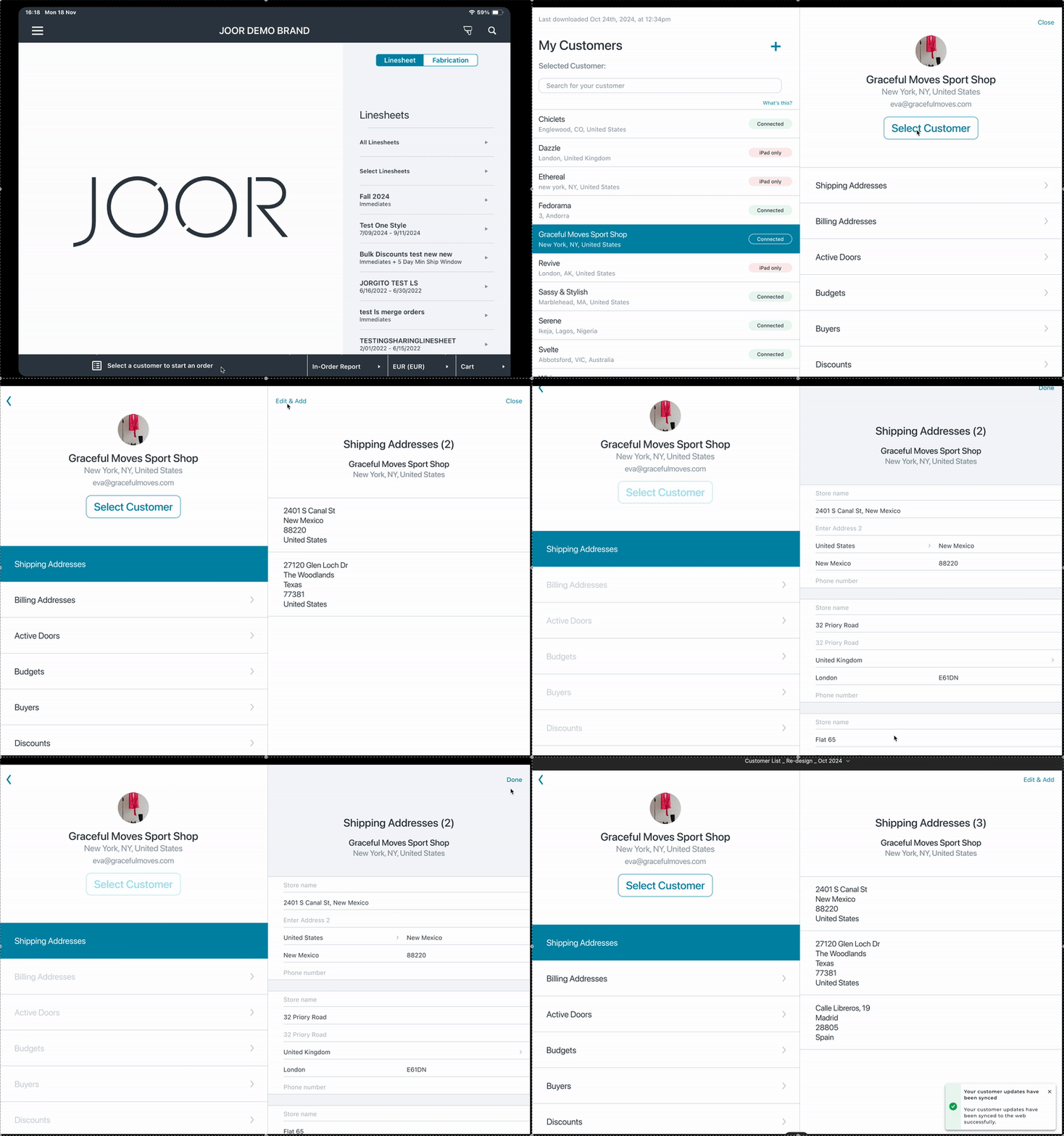
New Contact List
This prototype demonstrates how to locate a customer, view their profile, and update or add details by tapping ‘Edit.’ Changes sync automatically once saved.
New Footer
This prototype showcases the updated footer, which now adapts based on customer selection. A new icon highlights access to the Customer List—a feature many users previously overlooked.
The redesign also improved error handling. Previously, tapping the footer triggered alerts even when users didn’t intend to switch customers. The new design allows seamless access to the Customer List, with alerts appearing only when selecting a different customer, clearly explaining the implications.

Lessons Learned
- Clarity is Key: Features hidden behind unclear icons or navigation can go unnoticed.
- Collaboration Drives Success: Close teamwork with engineering and customer success ensured the design was feasible and user-aligned.
- Incremental Improvements Matter: Addressing immediate issues significantly enhanced the user experience, even as we aimed for long-term changes.
Conclusion
The redesigned Customer List transformed the JOOR iPad app into a more intuitive, user-friendly tool. By focusing on user needs and leveraging native iOS patterns, this redesign laid the groundwork for future enhancements to JOOR’s mobile experience.