Bulk Edits Made Simple
Company
JOOR
Role
UX/UI Design & Research
Product
Wholesale platform (B2B)
Platform
Web
Problem
Users couldn't use existing 'Customer Groups' to manage linesheet visibility across multiple retailers, making the setup process tedious and inefficient.
Solution
Improved existing flow by changing selection patterns, introducing a system to create groups and filter them out.
Feature/Specs
Bulk setup, new radio buttons, ability to leverage customer groups, new filtering system.
Impact
- Cut setup time by 75–98% and increased retailer reach by an estimated 10–20%.
- Re-used and improved upon existing UI patterns for data filtering.
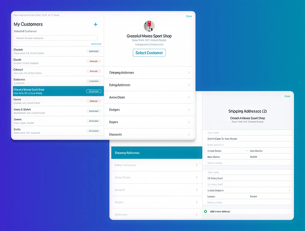
JOOR & Linesheet Visibility
JOOR is a wholesale fashion platform used by brands and retailers to showcase and buy seasonal collections.
Linesheet visibility decides who can actually see those collections (aka linesheets), and before this project that setup process was slow, manual, and infuriating.
The Problem
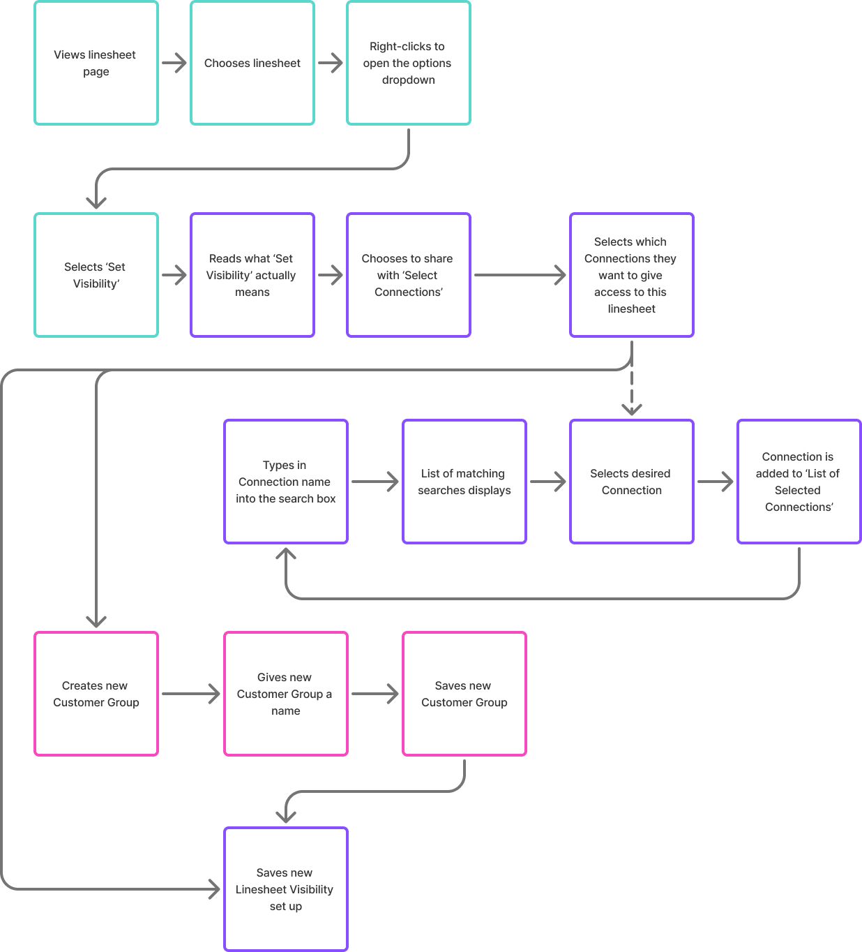
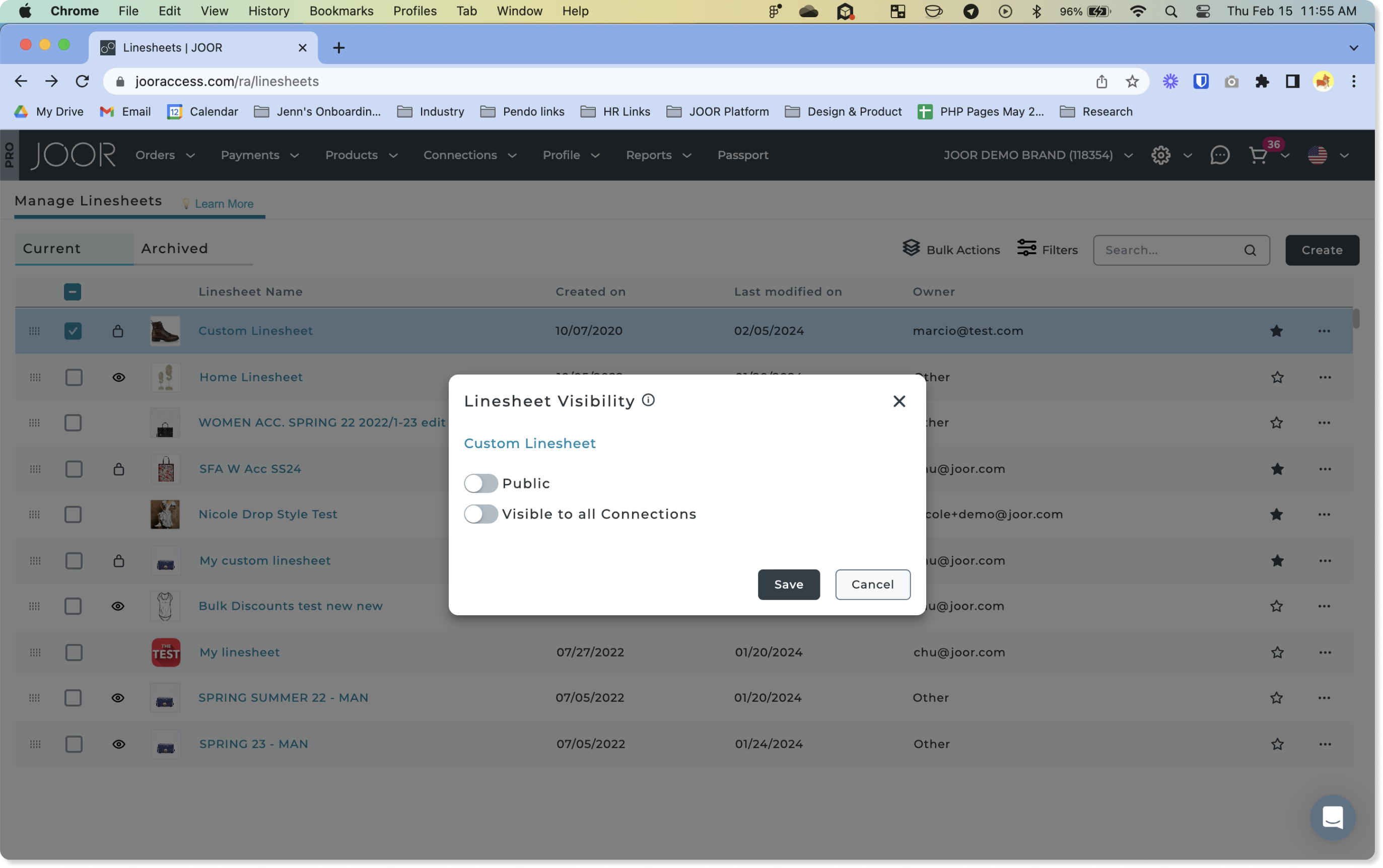
If a brand wanted to make a linesheet visible to a selected group of retailers, they had to manually pick those retailers every single time.
The platform didn’t remember those selections. There was no way to reuse or automate groups. And although “Customer Groups” technically existed, they weren’t integrated into the visibility flow at all.
This created a messy, repetitive process that scaled terribly as soon as a brand had more than a handful of retailers. Launching new collections took longer than it should.
Pain points I focused on:
- No way to reuse retailer groups across multiple linesheets.
- Confusing toggle logic for visibility states.
- A UI pattern that forced users to start from scratch every time.
Strategic Opportunity
Here’s the thing: the platform already had Customer Groups — but they were underused and disconnected from the visibility setup.
This wasn’t a problem that needed a brand-new feature. It needed a smarter connection between existing systems. By extending the use of Customer Groups and simplifying the interface, we could solve a major pain point with minimal engineering overhead.
That became the strategy:
- Reduce repetitive work.
- Leverage what already exists.
- Ship something valuable fast.
Research & Insight
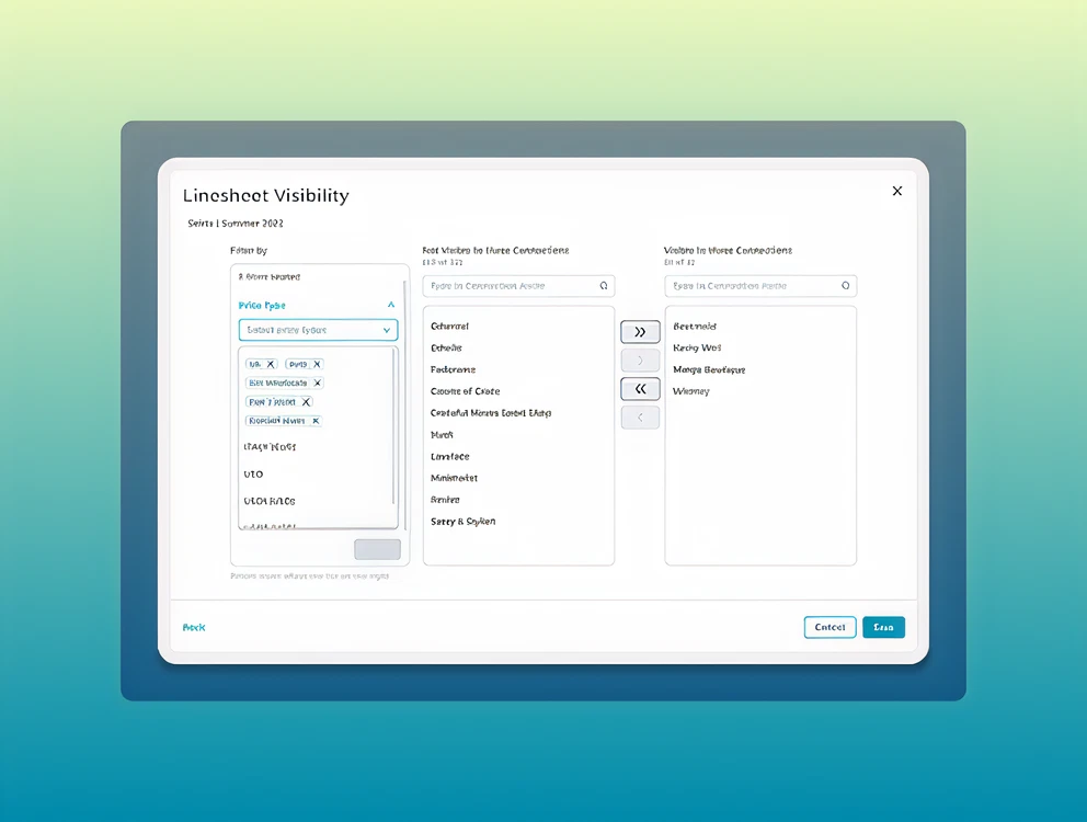
I didn’t want to guess. So we ran quick user feedback sessions and internal tests to understand how users handled large datasets elsewhere in the product.
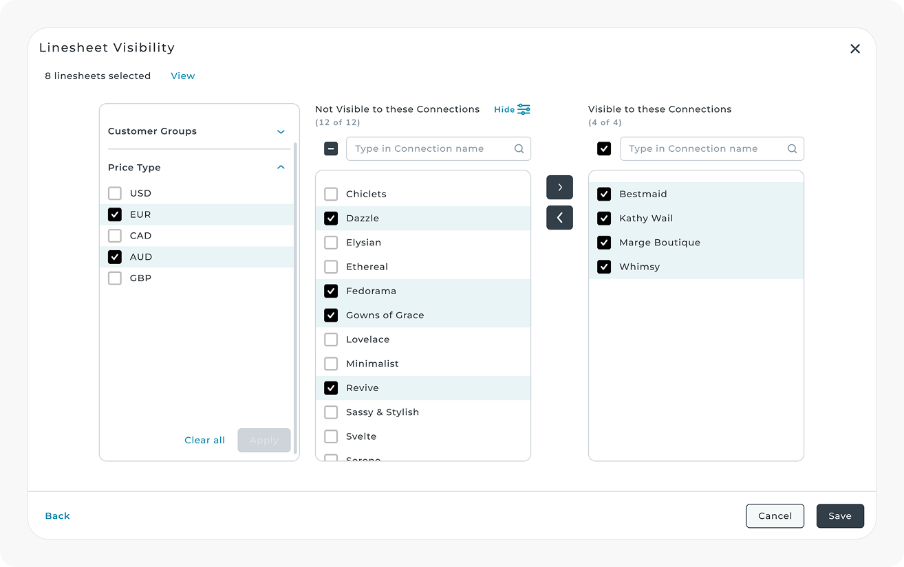
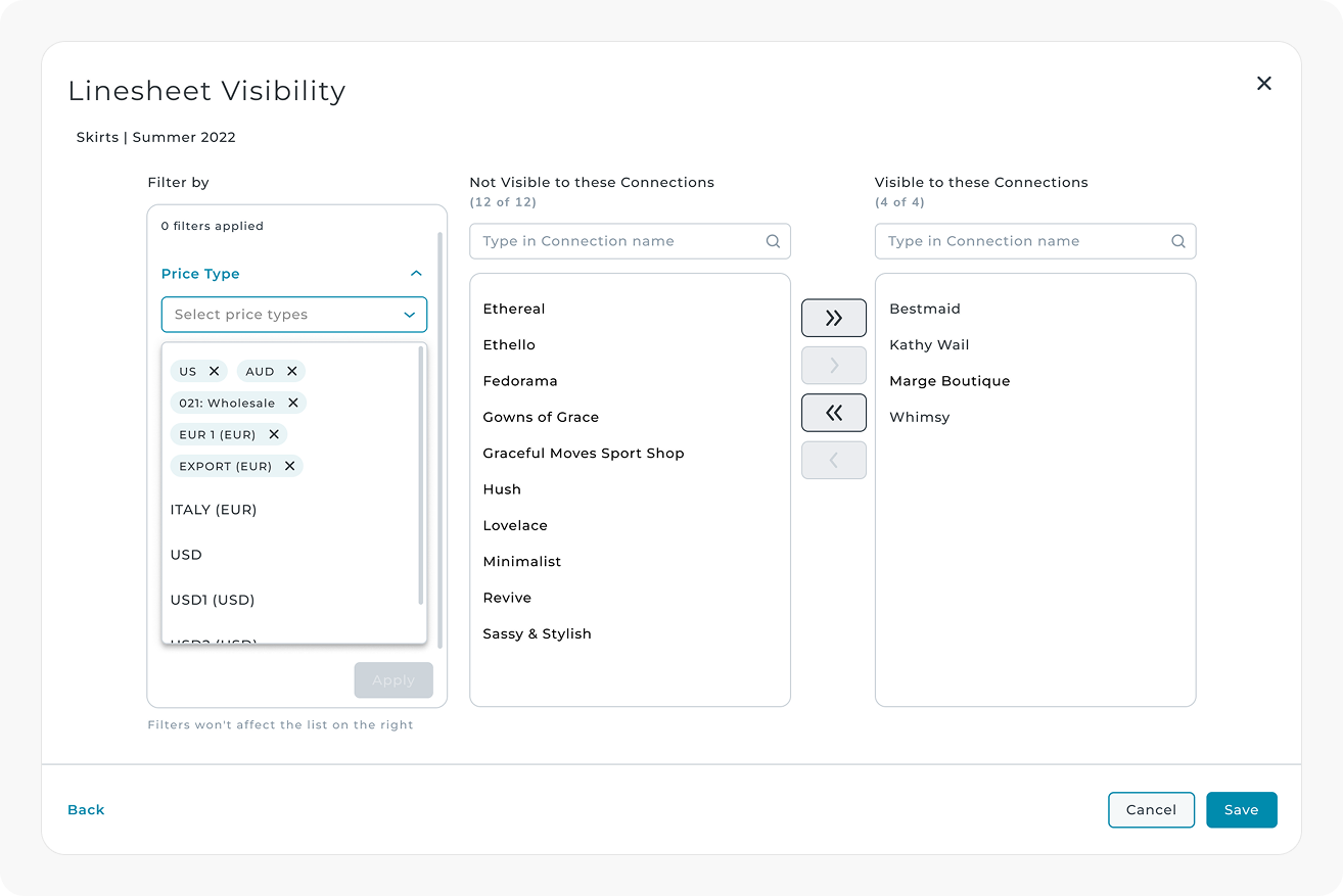
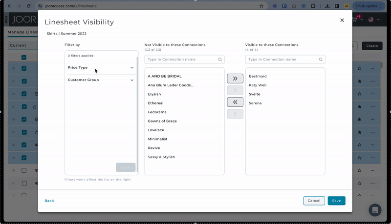
Unsurprisingly, they consistently preferred the dual-listbox UI — an old-school but solid pattern that let them search, filter, and select in bulk without getting lost.
We also discovered that:
- Customer Groups weren’t top of mind, but filtering was.
- Many users sorted by Price Type, not just predefined groups.
- Familiarity mattered more than flashy new patterns.
This shaped the direction: lean on what users already know, don’t reinvent the wheel.
Strategic Decisions & Trade-offs
Initial vision
- Creating and saving new Customer Groups directly from the visibility modal.
- Expanding filtering and categorisation options.
Scaling Back
But scope matters. Duplicating functionality that already existed elsewhere would slow us down, and the complexity would balloon fast.
So we trimmed:
- Phase 1: Introduce bulk visibility actions and group selection using existing Customer Groups.
- Phase 2: Add filtering for Customer Groups and Price Type to improve discoverability.
- Postponed: In-modal group creation (a future iteration, not a blocker).
This approach let us deliver value quickly without over-engineering.
Understanding the terrain
Before touching any UI, I mapped out the existing visibility flow to understand where we could intervene with minimal disruption. The goal wasn’t to redesign everything — it was to thread the new functionality into the current system in a way that felt natural.
I captured the critical screens, highlighted the touch-points that mattered, and quickly spotted the bottlenecks: too many clicks, duplicated effort, and unclear states.
A Scalable Flow
I designed the new flow with two phases in mind:
- Phase 1: Bulk visibility actions + integration with existing Customer Groups.
- Phase 2: Group creation inside the modal for a fully self-contained experience.
Phase 2 looked great on paper but came with added complexity and resource demands. Rather than letting the perfect delay the useful, I scoped it out for a future iteration.
This intentional phasing gave us a clear, implementable MVP without boxing the product into a dead end.
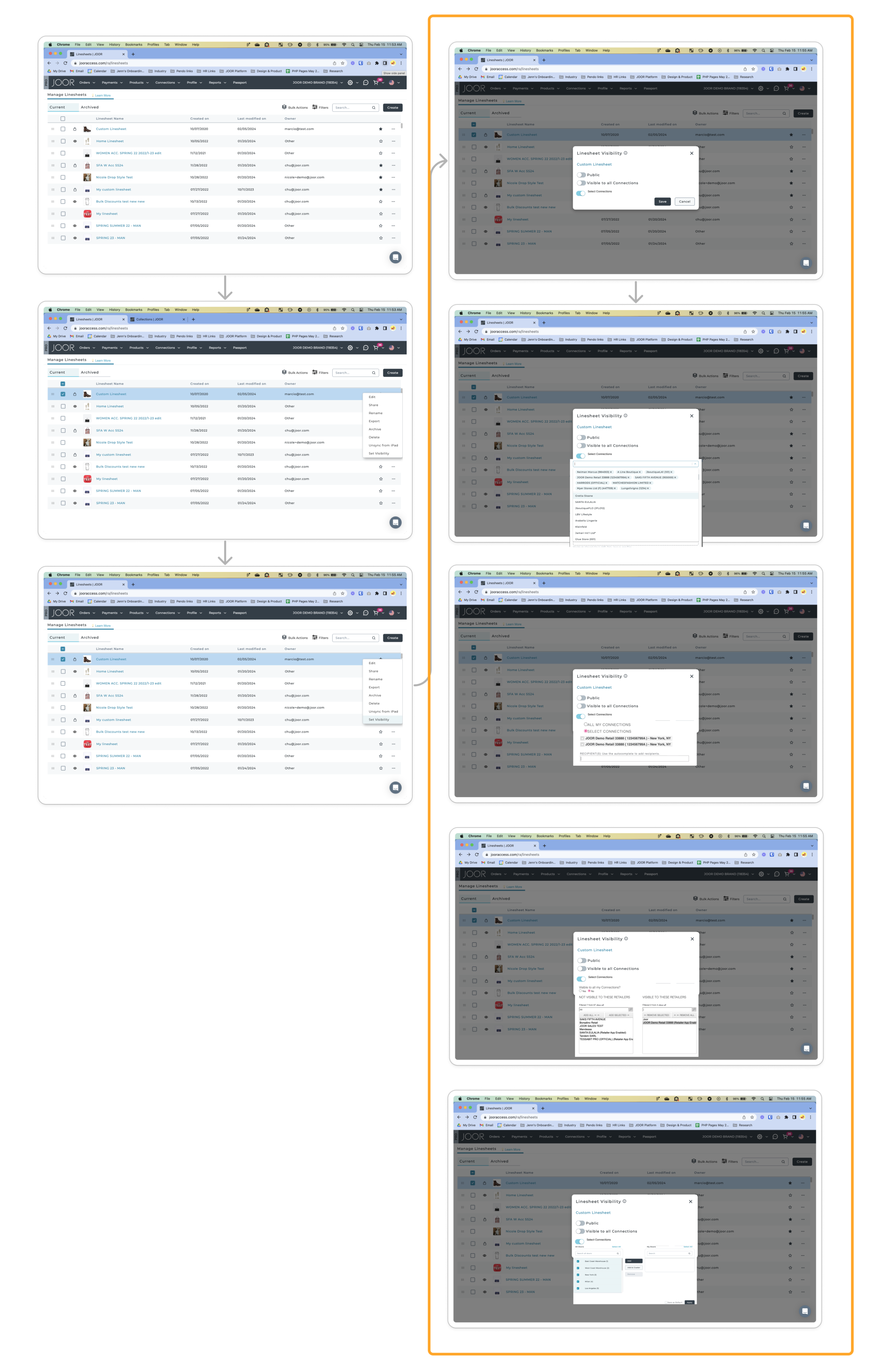
Simplifying the UI
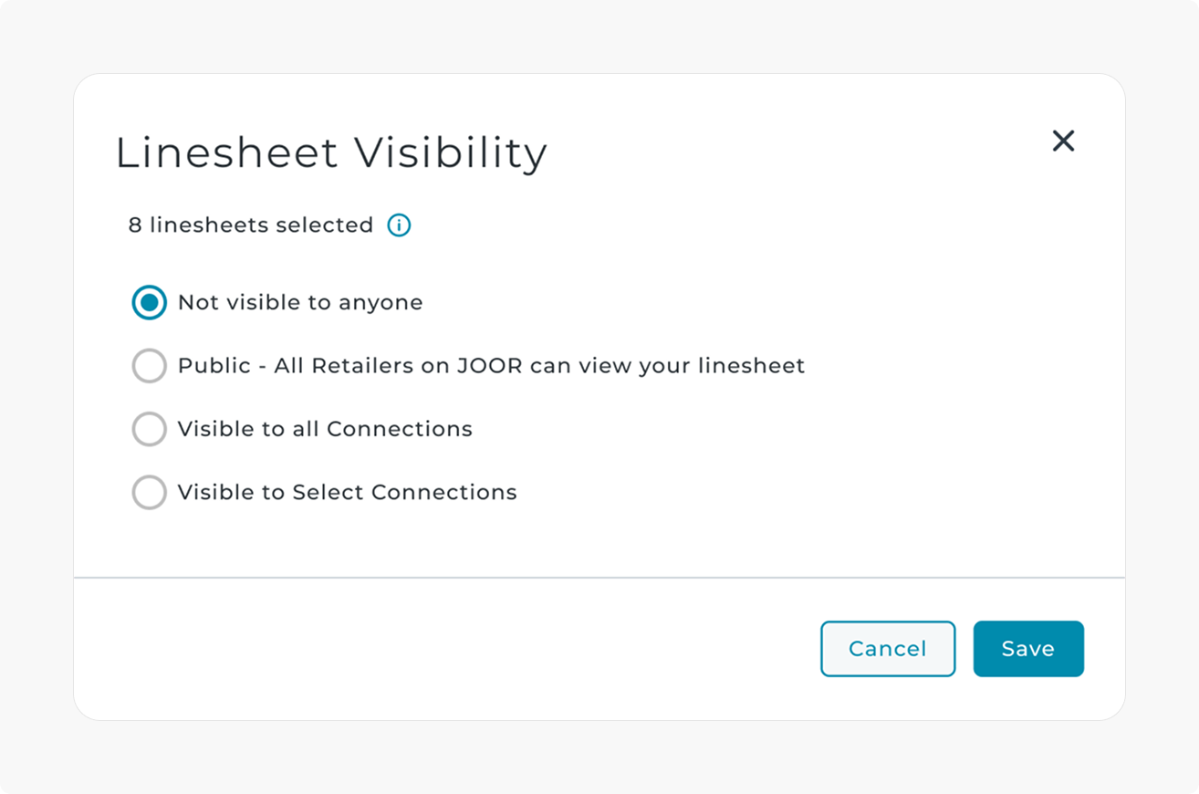
The original modal used two toggles (Public + All Connections) that interacted in unpredictable ways. Making a linesheet private meant turning both off — a small but maddening detail.
The redesign replaced toggles with radio buttons, making the logic clear and linear:
- Public
- All Connections
- Select Connections
No more toggles fighting each other. No more “what just happened?” moments.
Exploring Interaction Patterns
I explored several different approaches to refine how users select and move connections between lists. The goal wasn’t to make it “fancier,” but to remove friction without introducing new complexity.
- Inline Add/Remove buttons seemed efficient on paper. Fewer clicks, faster movement. But in practice, it created new pain points — unselecting became harder, and the interface felt busy.
- Checkbox selection was another idea. It aligned well with bulk selection patterns elsewhere in the product. But it clashed with the filter checkboxes and risked creating visual noise.
Both were discarded not because they were “bad ideas,” but because they introduced more cognitive load than they solved.
The dual-listbox won because it balanced clarity, speed, and familiarity. Users already trusted it. It didn’t need explaining.
Leveraging Familiar Patterns
For the “Select Connections” flow, I embedded the dual-listbox UI users already trusted, added filters for Customer Groups and Price Type, and improved the layout to reduce visual noise.
I explored other approaches:
- Inline Add/Remove buttons — too fiddly.
- Checkbox selection — conflicted with filters.
- Dropdown selection — too clunky for large datasets.
Dual-listbox won because it hit the sweet spot between usability, speed, and technical feasibility.
Solution & Rollout
Phase 1
- Introduced bulk Linesheet visibility actions.
- Enabled selecting existing Customer Groups via radio buttons + dual-listbox.
Phase 2
- Added filters for Customer Groups and Price Type, making it faster to find the right retailers.
- Improved overall discoverability and reduced setup steps.
Future
- Option to create and manage Customer Groups directly in the modal.
Impact
- ⏳ 75–98% faster setup time for visibility
- 🛍️ 10–20% increase in retailer reach thanks to easier sharing
- 🔁 Reused and improved existing UI patterns (lower dev lift, faster shipping)
- 🧭 Cleaner, more predictable interface with fewer support tickets
But the real impact wasn’t just about speed — it was about making a frustrating task feel effortless. By aligning product strategy, design, and user behaviour, we turned a tedious process into something brands barely have to think about.
Takeaways
- Good UX doesn’t always mean new UI. Sometimes, the best solution is to reuse a solid pattern.
- Strategic scoping can make or break delivery speed.
- Incremental improvements, when well-aimed, can unlock outsized impact.
Currently open to contract and full-time work. Reach out to irenealgi@gmail.com for more information.
© Irene Alegre 2025