Twice Faster,
Far Clearer
Company
JOOR
Role
UX/UI Design & Research
Product
Wholesale platform (B2B)
Platform
Native iPad app
Problem
Users found creating orders for new customers too slow, and we noticed too many duplicate accounts.
Solution
Reduced friction by introducing optional steps, native iOS patterns, feedback, error states and functional layouts.
Feature/Specs
Optional step, native iOS patterns, improved checkout screen, dynamic error states.
Impact
- Reduced time to add new customers by 50%.
- Positive user feedback after implementation.
- Reduced customer account duplication.
What is JOOR?
JOOR is a B2B wholesale platform connecting fashion brands and retailers. Half of all orders happen on the iPad app — built to run offline so sales reps can keep working at tradeshows or in showrooms without Wi-Fi.

Coterie, one of the largest fashion tradeshows, in New York City
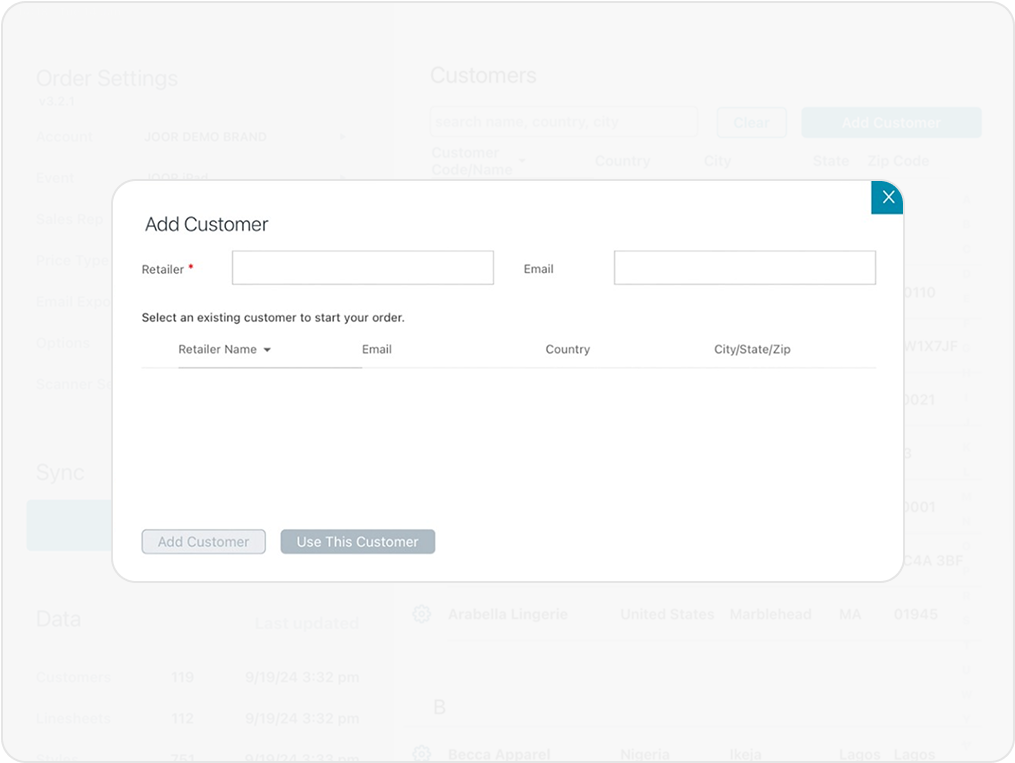
Existing flow
Sales reps begin in the Customer List, where they can quickly pull up an existing customer or create a new one on the spot. From there, the flow shifts into order building — selecting linesheets, adding products, and reviewing the cart. The process wraps with checkout and order submission, all designed to work seamlessly offline and sync later to the web.
Research & Validation
I ran multiple research and feedback rounds:
- Unmoderated testing (Maze): to pinpoint usability issues.
- 1:1 customer sessions: to validate concepts directly with users.
- Internal feedback: with Customer Success Managers to capture real-world pain points.
Insights confirmed users wanted speed first, with the option to complete details later.
Problem
Creating a new customer was painfully slow.
Sales reps had to fill out full customer profiles — including billing and shipping addresses — before even starting an order. Then they had to re-enter those same details at checkout.
Result: fake data, duplicate profiles, and frustrated users tapping away on the iPad keyboard.
The Goal
Make starting an order quick and flexible, without compromising data integrity.
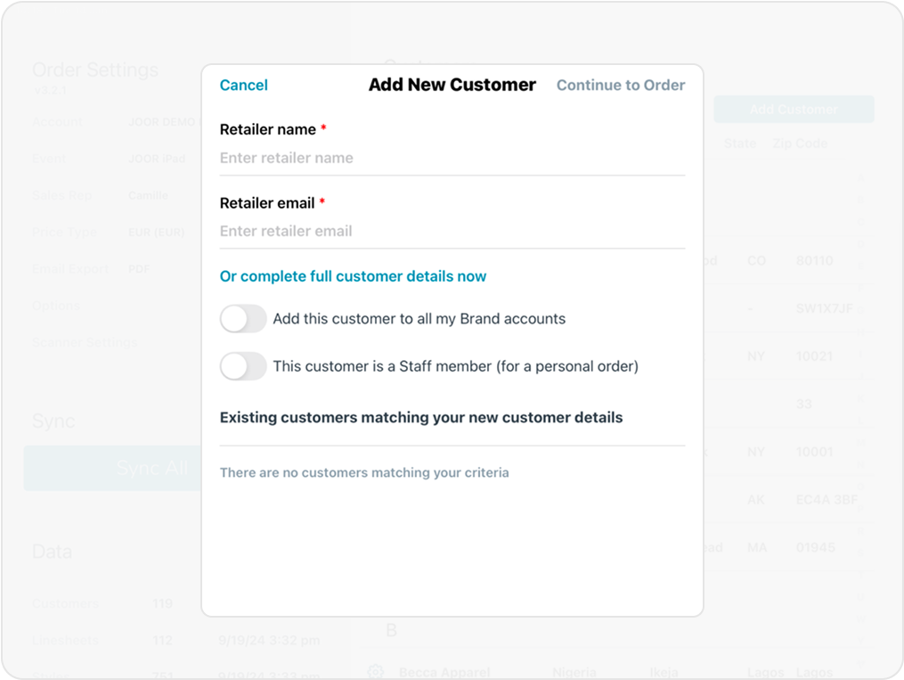
The Solution
I redesigned the flow to reduce friction and follow native iOS patterns. Key changes:
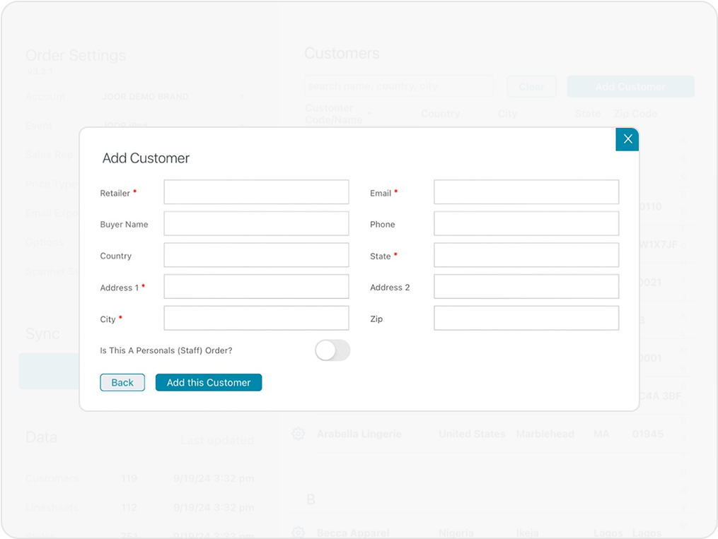
- Optional address fields: users can create new customers without full profiles.
- Streamlined checkout: order status moved from Cart to Checkout to cut steps.
- Redesigned modals: cleaner layouts, native CTAs, and better feedback states.
- Empty and error states: to guide users clearly through what’s required and what’s optional.
Together, these tweaks made the process faster and easier to understand.
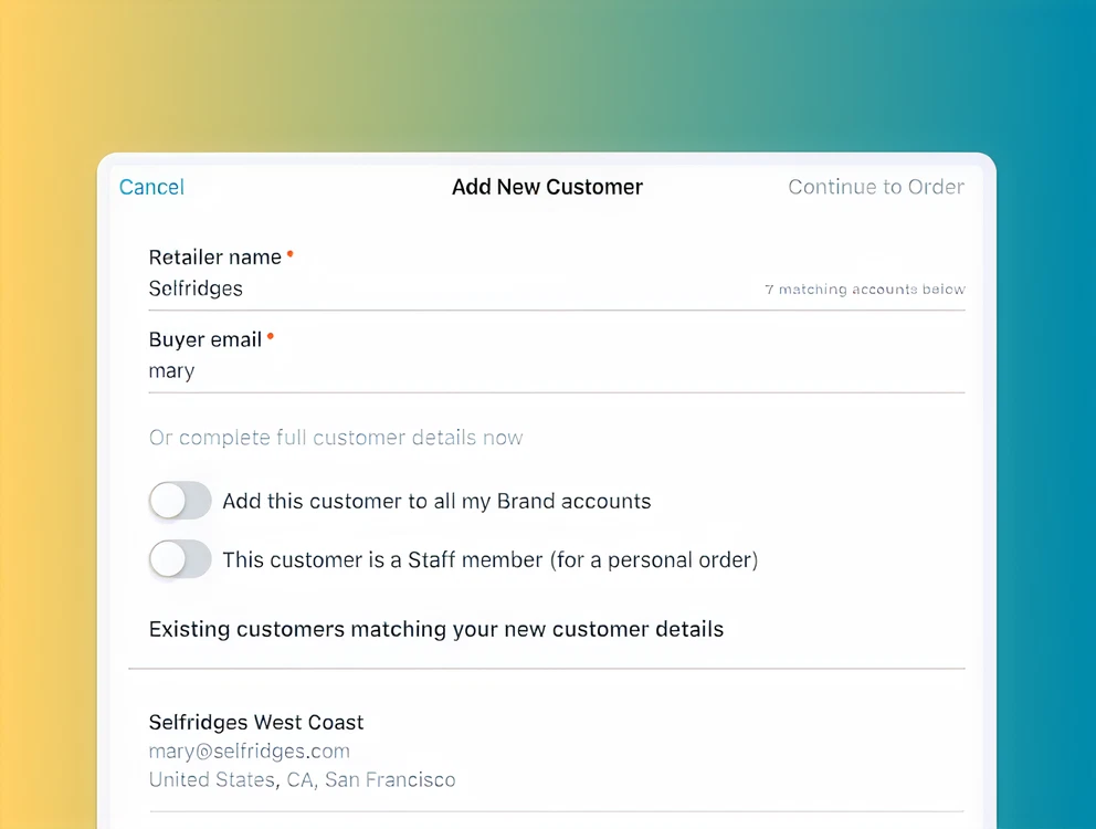
Key change #1
Updating the Checking Screen
From a cluttered, confusing modal to a simple iOS-aligned check that prevents duplicate profiles.
Key change #2
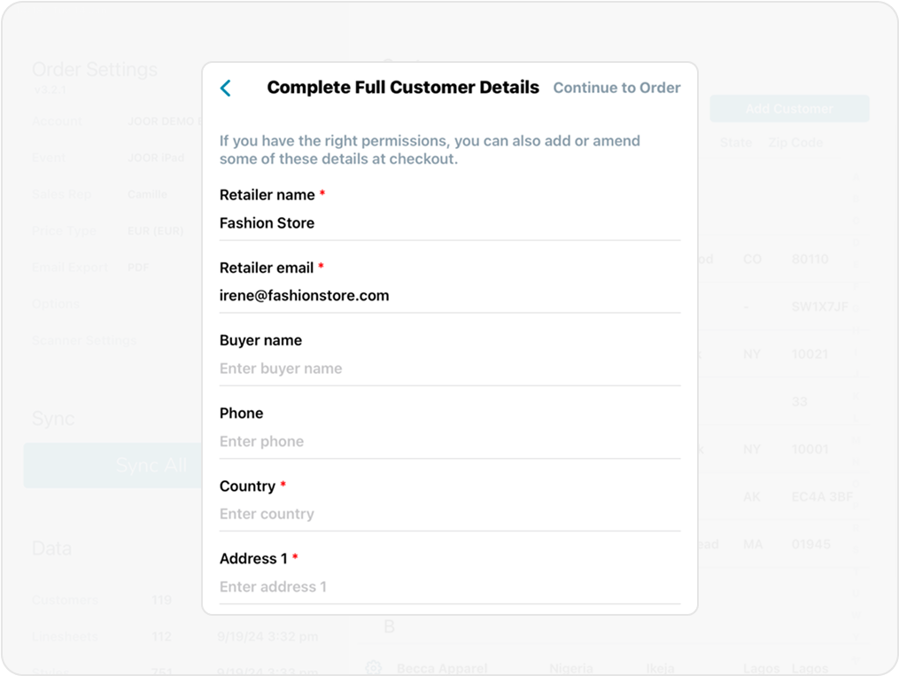
Improving the New Customer Form
Redesigned for clarity and scannability; optional fields moved to a more logical place.
Key change #3
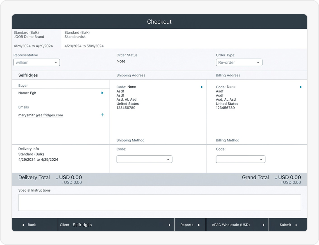
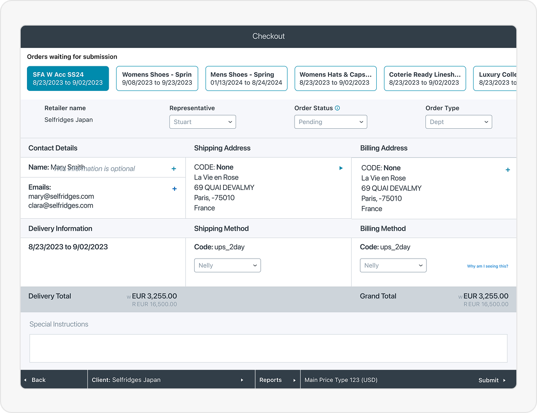
Moving the Order Status dropdown
I relocated the Order Status dropdown from Cart to Checkout, grouping all order-related actions in one place. This reduced steps, clarified hierarchy, and ensured address validation happened at the right moment.
Key change #4
Enhancing the Checkout Screen
Improved hierarchy, carousel redesign, and contextual empty states — making the final step intuitive and friction-free.
Impact
- 50% faster to create a new customer (based on internal timing tests).
- Positive feedback from user testing (“this is so much faster!”).
- Fewer duplicate accounts after rollout.
- Early signs of increased order submissions due to reduced setup friction.
Reflection
This project reminded me that usability isn’t just about beauty — it’s about momentum.
By simplifying the flow and aligning it with real-world workflows, we helped reps focus on selling, not typing.
Currently open to contract and full-time work. Reach out to irenealgi@gmail.com for more information.
© Irene Alegre 2025

Twice Faster,
Far Clearer
Company
JOOR
Role
UX/UI Design & Research
Product
Wholesale platform (B2B)
Platform
Native iPad app
Problem
Users found creating orders for new customers too slow, and we noticed too many duplicate accounts.
Solution
Reduced friction by introducing optional steps, native iOS patterns, feedback, error states and functional layouts.
Feature/Specs
Optional step, native iOS patterns, improved checkout screen, dynamic error states.
Impact
- Reduced time to add new customers by 50%.
- Positive user feedback after implementation.
- Reduced customer account duplication.
What is JOOR?
JOOR is a B2B wholesale platform connecting fashion brands and retailers. Half of all orders happen on the iPad app — built to run offline so sales reps can keep working at tradeshows or in showrooms without Wi-Fi.
Coterie, one of the largest fashion tradeshows, in New York City
Existing flow
Sales reps begin in the Customer List, where they can quickly pull up an existing customer or create a new one on the spot. From there, the flow shifts into order building — selecting linesheets, adding products, and reviewing the cart. The process wraps with checkout and order submission, all designed to work seamlessly offline and sync later to the web.
Research & Validation
I ran multiple research and feedback rounds:
- Unmoderated testing (Maze): to pinpoint usability issues.
- 1:1 customer sessions: to validate concepts directly with users.
- Internal feedback: with Customer Success Managers to capture real-world pain points.
Insights confirmed users wanted speed first, with the option to complete details later.
Problem
Creating a new customer was painfully slow.
Sales reps had to fill out full customer profiles — including billing and shipping addresses — before even starting an order. Then they had to re-enter those same details at checkout.
Result: fake data, duplicate profiles, and frustrated users tapping away on the iPad keyboard.
The Goal
Make starting an order quick and flexible, without compromising data integrity.
The Solution
I redesigned the flow to reduce friction and follow native iOS patterns. Key changes:
- Optional address fields: users can create new customers without full profiles.
- Streamlined checkout: order status moved from Cart to Checkout to cut steps.
- Redesigned modals: cleaner layouts, native CTAs, and better feedback states.
- Empty and error states: to guide users clearly through what’s required and what’s optional.
Together, these tweaks made the process faster and easier to understand.
Key change #1
Updating the Checking Screen
From a cluttered, confusing modal to a simple iOS-aligned check that prevents duplicate profiles.
Key change #2
Improving the New Customer Form
Redesigned for clarity and scannability; optional fields moved to a more logical place.
Key change #3
Moving the Order Status dropdown
I relocated the Order Status dropdown from Cart to Checkout, grouping all order-related actions in one place. This reduced steps, clarified hierarchy, and ensured address validation happened at the right moment.
Key change #4
Enhancing the Checkout Screen
Improved hierarchy, carousel redesign, and contextual empty states — making the final step intuitive and friction-free.
Impact
- 50% faster to create a new customer (based on internal timing tests).
- Positive feedback from user testing (“this is so much faster!”).
- Fewer duplicate accounts after rollout.
- Early signs of increased order submissions due to reduced setup friction.
Reflection
This project reminded me that usability isn’t just about beauty — it’s about momentum.
By simplifying the flow and aligning it with real-world workflows, we helped reps focus on selling, not typing.
Currently open to contract and full-time work. Reach out to irenealgi@gmail.com for more information.
© Irene Alegre 2025