- Project type: Personal project
- Participants: Irene Alegre
- Duration: 1 month
- Tools: Pen and paper, Sketch, HTML & CSS, GitHub, MacDown
- Methodologies: User interviews, user testing, branding, sketching
I like my portfolio. I mean, it’s not, like, the best portfolio ever, but I like it. It’s clean, it’s aseptic, it has just a tiny little bit of hot pink popping up here or there. It makes me feel kind of good.
But it wasn’t always that way.
Defining the specs
So many things could go in there; my photography, my blog, my Harry Potter collection! At first I went a little bit crazy. I mean, I’d never had my own web page before and I just wanted it to have it all.
But I was sensible. I am a sensible person, after all. So I just kept the idea of the blog, and then chucked everything else in there. Because you can turn a blog into anything.
So after battling against my own desires, I settled on to keep the following sections:
- Home page: this would have an introduction, plus the most recent case studies
- Case studies page: this would compile all the case studies
- About page: this would tell the user all about me and my hobbies
- The blog: in here I would write a lot about stuff (to be fair, I do write quite a lot)
Defining the style
I’m a minimalist, so I went with a 3-colour palette: white, black and hot pink. I picked one typeface — Montserrat– as the main font. Here are some of my screens.
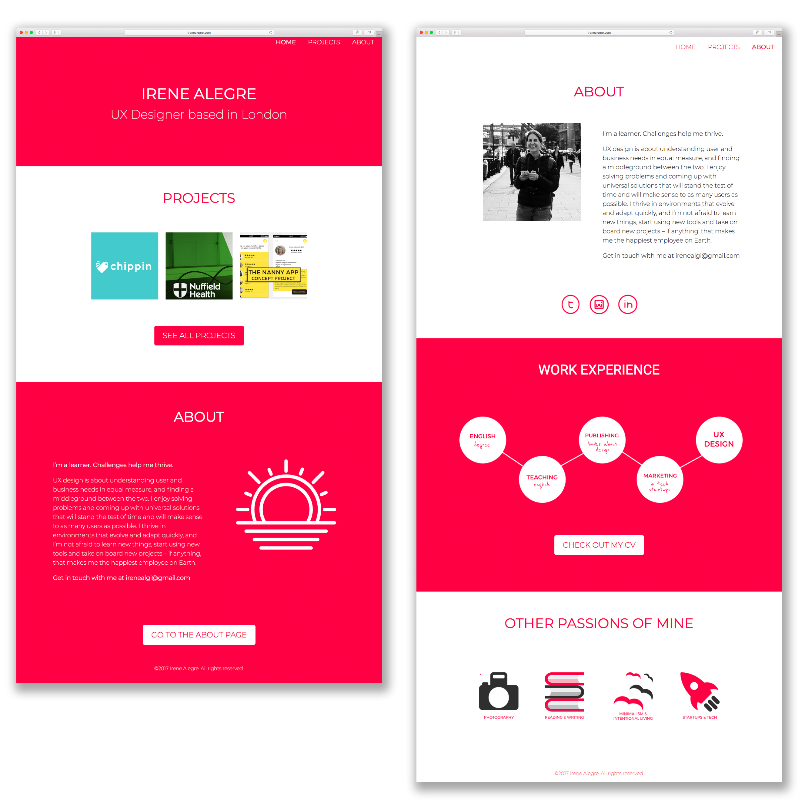
It was alright, although people were a bit shocked by its pinkness. But when I added the images for the case studies, the pink suddenly clashed with everything else. Alas, most portfolios are white — or black– for a reason.
Suddenly, I wasn’t happy with it anymore. I hated it.
Re-designing and re-building
By then I had actually built the site with some help from my very patient partner Arturo Herrero, but mostly on my own. I was really impressed with myself, although when Arturo saw the CSS sheet he almost cried. Apparently it was quite messy, but hey — it worked.
Regardless, that pink was killing me and it had to go. So off it went. At that point I started to look at many other Junior UX portfolios, which I had avoided doing before because I was afraid I would end up copying them, but I found the process quite useful to get some ideas.
I decided that I would place the case studies vertically on the home page — rather than horizontally– so that they wouldn’t look weird if it was there were more than three, or less than six. That way I could also add a brief explanation for each of the projects.
And then Arturo said:
Do you really need a Case Studies page if you only have three case studies?
Which was a fair point. Because, no, I really didn’t. It’s just that everyone has one, and so I thought I should have one myself. So I scrapped that too.
And I started simplifying. I removed everything that wasn’t truly necessary.
- The circled images
- The fancy graphs
- The words “Case Studies”
- The “passions” section, whatever that was
And here’s what I kept
- A home page with my few case studies
- An about page with a photo, some links and my contact details
- A link to the blog
Changing the font
I know that — in theory– sans-serif fonts work better on the web, but I really like Medium’s format, and the platform uses a big serif font. PT Serif at 21px, to be more exact. And, yes, that’s what you’ll find on my website because, if something works, there’s no point in fixing it.
Designing the blog
I was inspired by Arturo’s own website, which has an archive with some content he’s written over the years. I liked the simplicity of it, and the fact that I could have the link at the top take users to a list with all the blog posts, and they could always go back to the same link for more, thus removing the need for pagination.
It was clean and functional.
Designing alongside a dev
Arturo said he would build the website himself (and yes that is a Virginia Woolf reference because I’m a freak), so now I had to have a good idea of what I wanted and how I wanted it. A really good idea.
Arturo had many questions.
- What size are the images? — 450x450
- What size is the font? — 21px
- Is this a title? And is this a title? Can they be the same style? Why not? — because they convey different types of information
- Are blog posts and case studies going to look the same? — yes
- What’s the distance between this and that element? …
Conclusions
I have enjoyed the process of putting together my own website, and it has taught me a lot about no-nonsense design, as well as user experience. Because, ultimately, my website is not really meant to be seen by me.