- Project type: Work project
- Duration: 1 month
- Tools: Pen and paper, Sketch, Whimsical, Invision
- Processes: User testing, card sorting, mind-mapping, sketching, prototyping
Wayhome is an alternative to renting that enables customers to gradually purchase the home they live in. Home buyers contribute with a 5% deposit while an institutional investor covers the cost of the rest of the property so that the customer can buy it from them little by little.
One of Wayhome’s main objectives is to be able to procure prospective home buyers with a database of properties they can flick through and choose their perfect house from. In order to build this database, an Operations Team consisting of Property Specialists (PS) has been tasked with filtering through all UK’s properties so as to find the ones that would match the expectations of both customers and institutional investors. The PS team has defined what makes a good enough property and they have started a process they call pre-filtering.
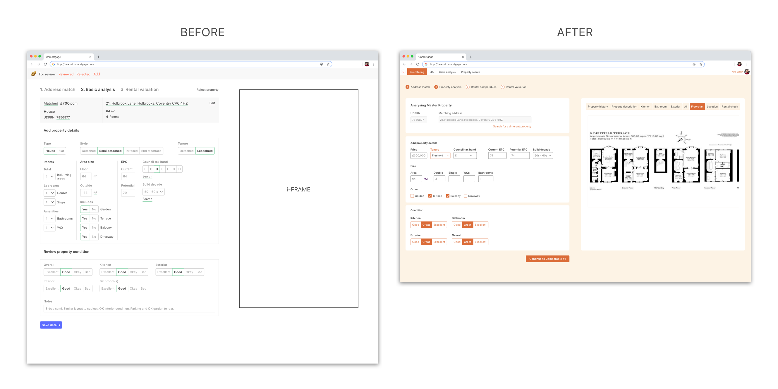
The current Pre-Filtering process
The Pre-Filtering process involves a Google Sheet and links to various sources of information. The Google Sheet comprises a long list of links to properties, as well as several columns where the PS team have to input data on the suitability of each property.
“It’s very clunky and difficult to use. As property specialist, we spend too much time switching between cells on the spreadsheet and it’s too easy to make a lot of errors. We’re constantly switching between tabs in the internet browser and it makes it difficult to keep track of the property you’re currently assessing.” – Sophia
The order of factors does change the product
Properties go through a pre-filtering process that involves several stages, and every property can fail at any given stage. This helps our Data Team collect – well – data and have a better understanding of the property market and the type of houses that can be found in different areas across the country.
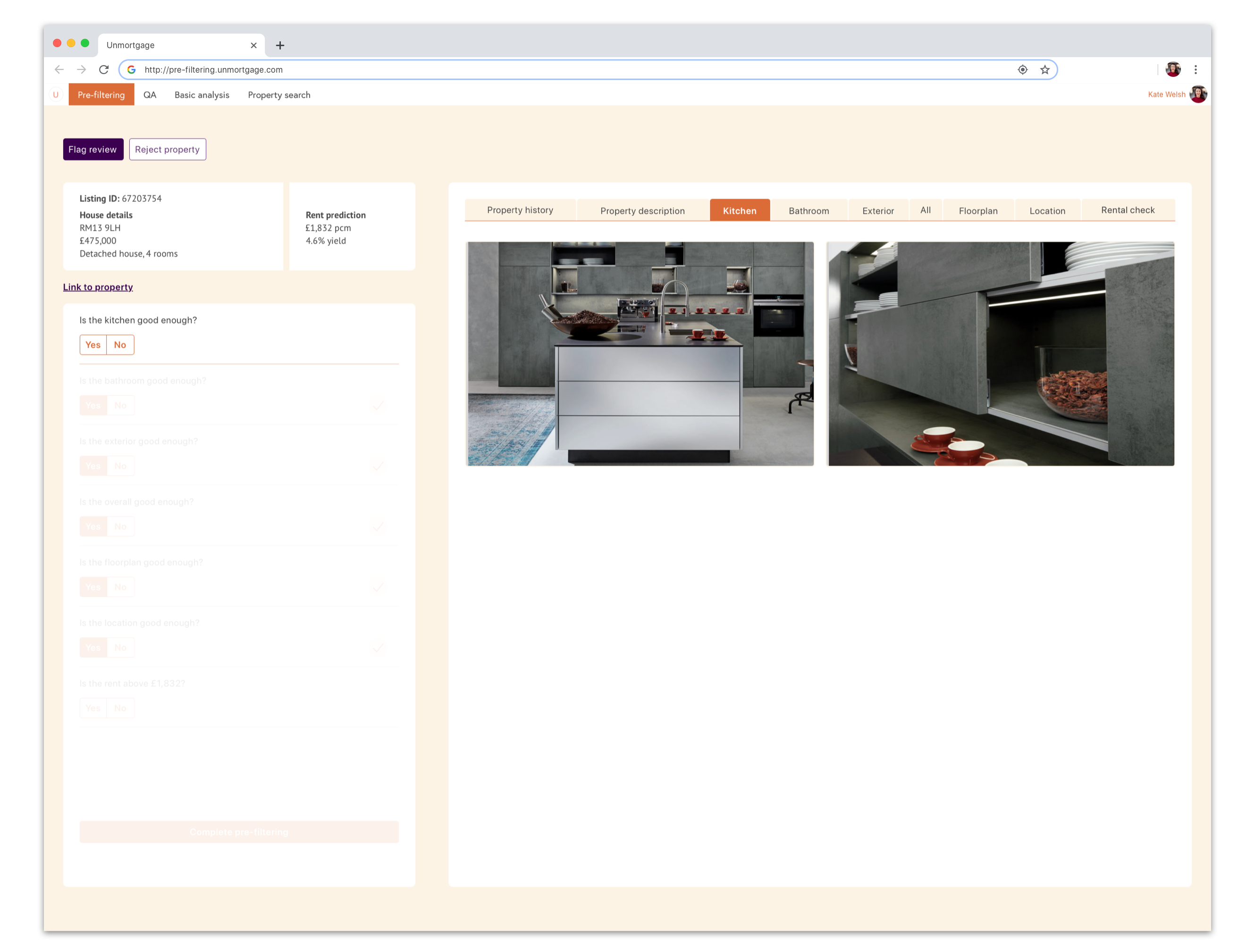
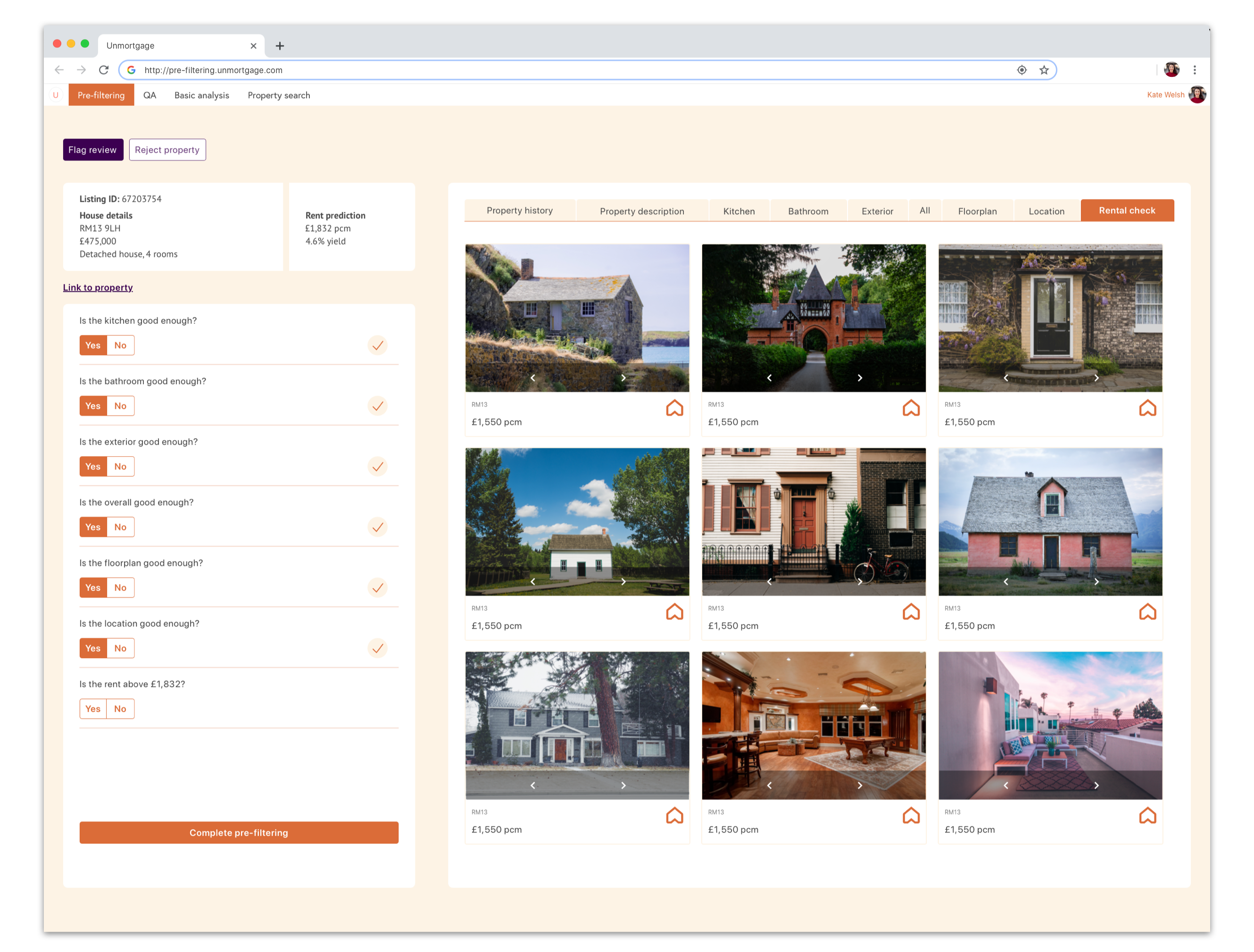
The following are the numerous steps through which the PS Team will go for every single property they review:
- How good is the kitchen?
- How good is the bathroom?
- How good is the exterior?
- How good is it on the overall?
- How good is the room distribution across the floorplan?
- How good is the location in terms of transport links. neighbourhood, noise…?
- Does the rent the system predicted for this property match the current market for the area and type of property?
For each of these questions, the PS Team have to go on different sites, flick through images, floorplans, Google Maps and property listings, and then go back to the spreadsheet to fill out each category.
The brief
The Property Specialist Team needed a solution that was:
- Fast (so that they can get as many properties into the system as possible).
- Easy to use (so that there is as little friction as possible, and so that new product specialists can start using it quickly and with ease).
- Pleasant to the eye (aesthetics were not a priority, but it is a tool they will be looking at for hours at a time).
With speed as my main priority, I started working on a piece of software that would reduce (or even eliminate!) the need to go back and forth from online resource to online resource. In order to do that, I had to make sure that the relevant data could be pulled from the various sources.
Given that this is an internal tool for a team that does go through internal training anyway, ease of use was not as much of a priority as speed. However, in the old process the users were asked to rate each part of the property from 1-4 where 1 was really bad and 4 was really good. After doing some digging, it became apparent that the users were struggling with 2s and 3s, which added an unnecessary level of friction to the process and made our data more error prone (as the ratings were very subjective). I raised the issue with the Data Team, who agreed to simplify the data requirements and change our rating system to an Is this xxxxx good enough?, where YES or NO would be the only possible answers.
After testing this assumption, it became clear that users were indeed more comfortable rating properties in that way.
The first designs for this tool inherited the styling of another internal tool within Wayhome. The resulting designs were somewhat functional but lacked structure and definition. It being a set of screens with several groups of information, it was very important to get the details right in order to achieve objectives 1 and 2.
A tool to rule them all
I went on to design a tool that would enable the PS Team to speed up the pre-filtering process and help us build a database of acceptable properties faster and more robustly.
Re-designing the UI for the entire back-office software
The original UI for Wayhome’s internal tool was a little bit clunky and lacked structure, so I re-designed the the entire interface by dividing each screen in several components (boxes) that would separate each part of the process.