Efficiency at Every Tap
Company
JOOR
Role
UX/UI Design & Research
Product
Wholesale platform (B2B)
Platform
Native iPad app
Problem
Users struggled to navigate the customer list, were unaware of existing features, and requested missing functionalities like editing customer information outside the order flow.
Solution
Increased awareness of existing functionality and introduced a more flexible UI by re-designing the dashboard and leveraging common native iOS patterns.
Feature/Specs
New screen, viewing and editing capabilities, new notifications (feedback), automatic customer syncing, navigation improvements.
Impact
- Cut editing time by an estimated 60–85% and reducing duplicate profiles.
- Usability testing feedback was very positive.
- I loved this project—it taught me to think outside the box and explore new approaches.
What is JOOR?
JOOR connects fashion brands and retailers so they can create and manage wholesale orders together. Half of all orders happen on the iPad app — designed to run offline at tradeshows or showrooms and sync seamlessly once back online.
This redesign was part of a broader effort to modernise JOOR’s mobile experience and reduce friction in the sales process.
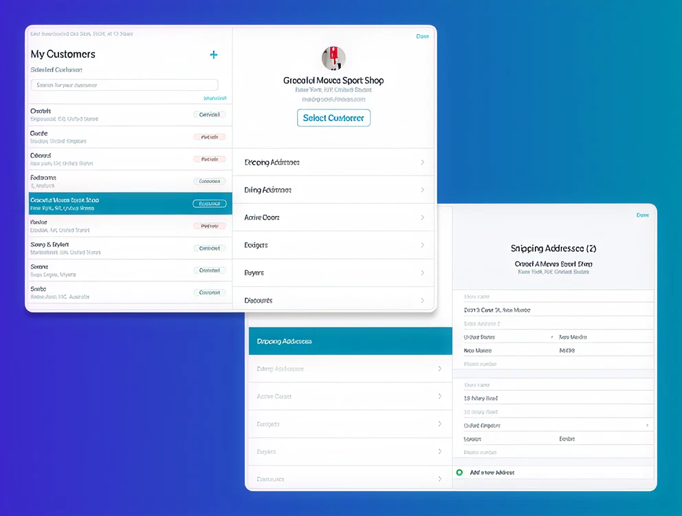
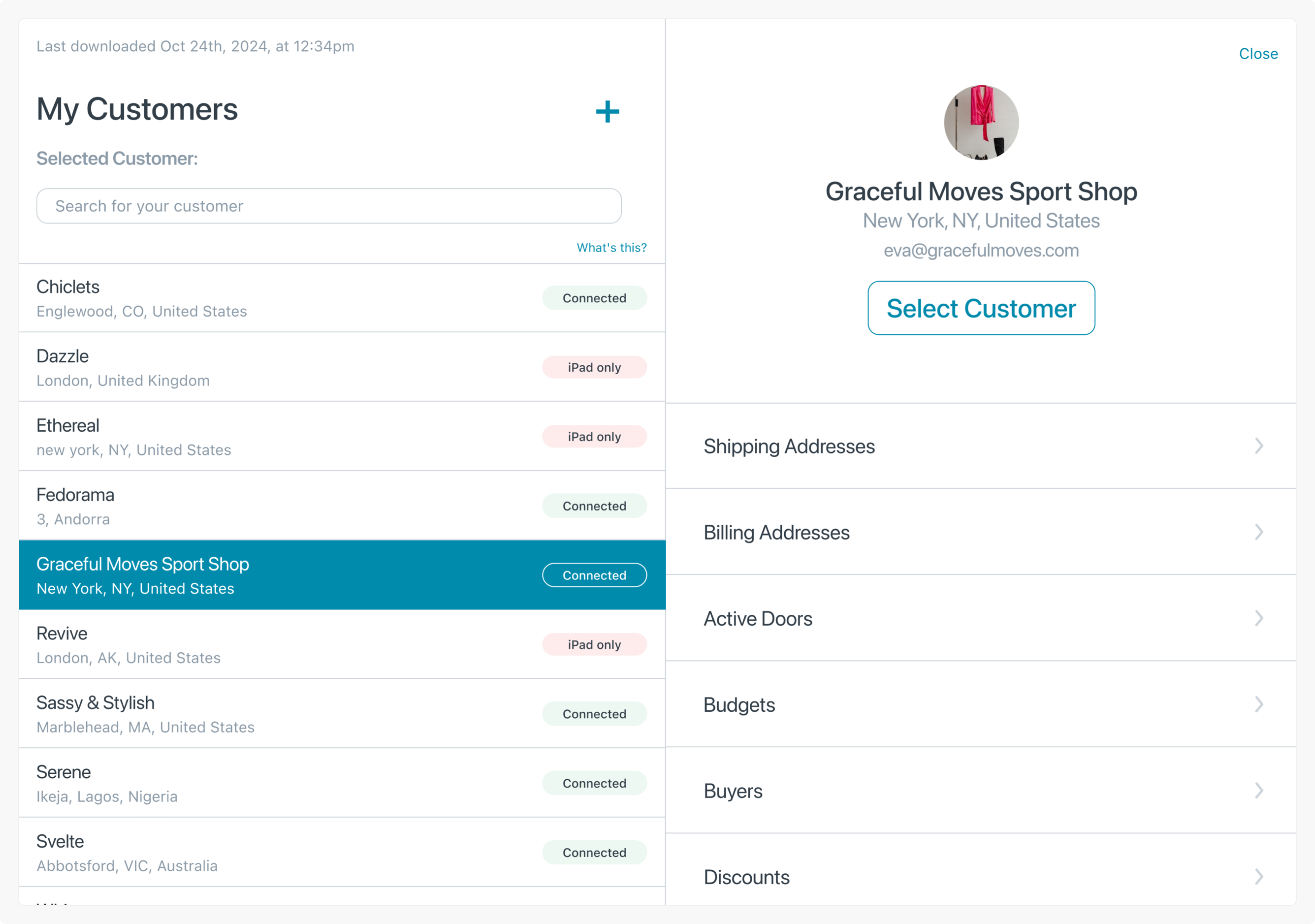
The Customer List
JOOR’s iPad app includes a list of customers from which they can either select an existing customer or create a new one. It is one of the app’s core screens, and user interviews at the start of the year revealed several pain points.
Collaboration
This project was built in lockstep with:
- PM: Keeping scope laser-focused on core user pain.
- Engineering: Ensuring technical feasibility and database efficiency.
- Customer Success: Bringing field insights from real-world users.
- Users: Validating prototypes early — one called it “amazing.”
Problems
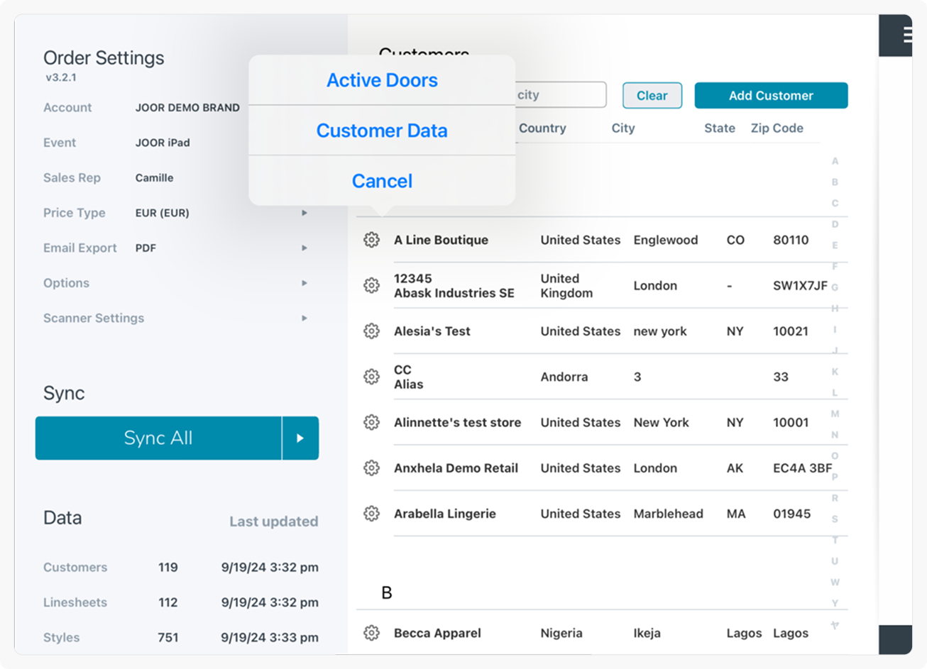
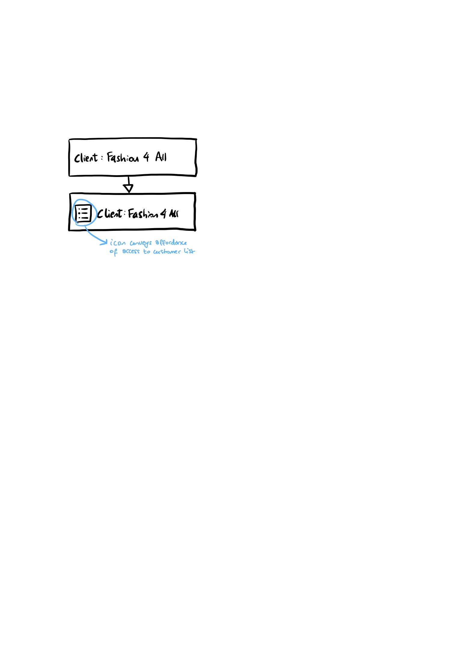
Accessing the list
The option existed but was buried; few realised it could be opened mid-order.
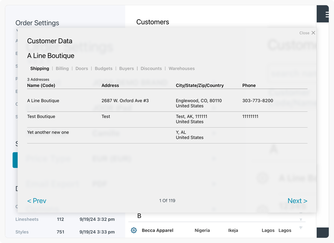
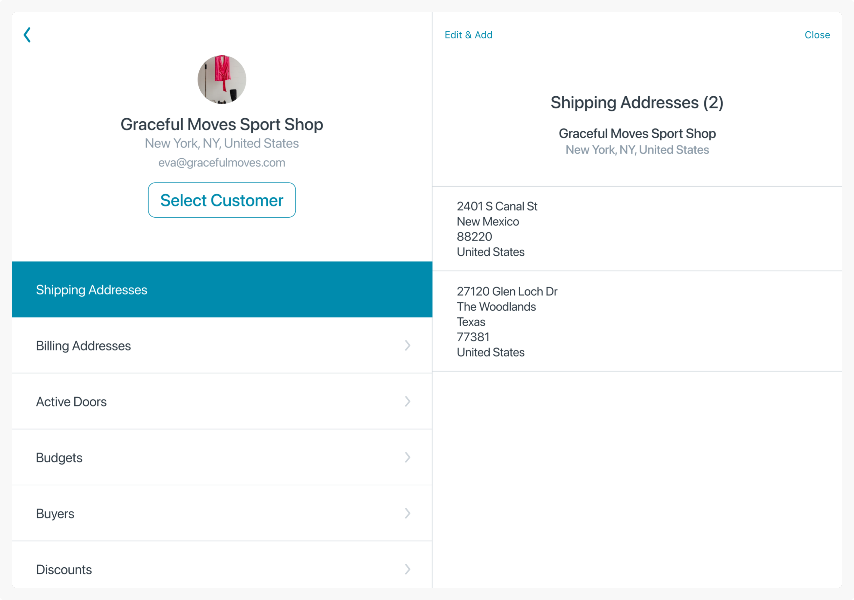
Viewing info
Hidden behind a gear icon — even power users missed it.
Editing details
Only possible during checkout, forcing awkward workarounds.
Duplicate profiles
“Add Customer” was visually louder than “Search.”
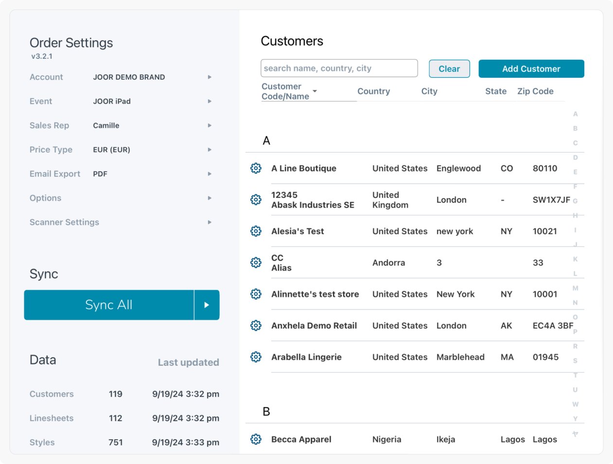
Manual syncing
Outdated for 2024 — most users now had reliable Wi-Fi.
Reimagining the UI
With engineering rebuilding the screen from scratch, we turned it into a contact management tool inspired by Apple’s Contacts app.
Search first
Users can now find before they create.
Instant details
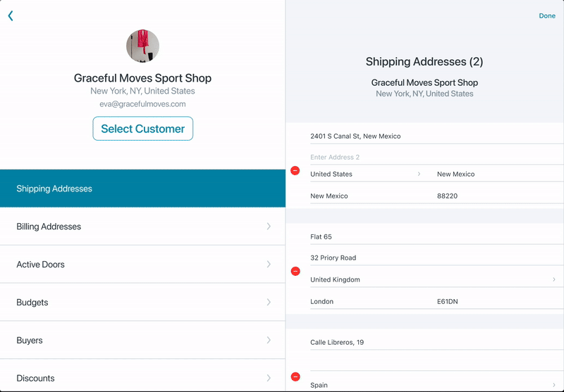
Customer info surfaces immediately after selection.
Inline editing
Update details on the spot — no dummy orders required.
Start orders instantly
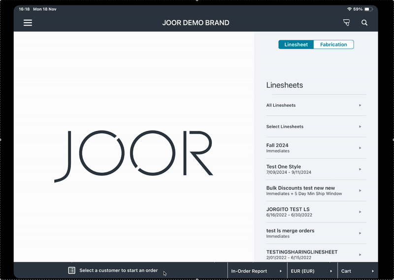
A clear ‘Select Customer’ button now makes the next step obvious — no guesswork or hidden actions.
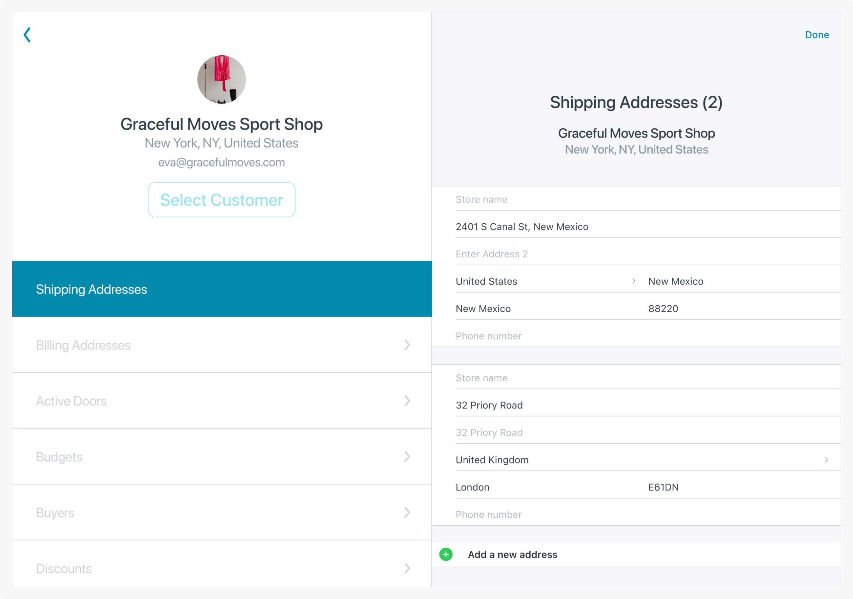
Syncing Mechanism
Taking advantage of improved iPad internet connectivity, the redesign introduced:
Automatic Syncing
Customer data now updates across app and web
Push Updates
Changes made on the iPad automatically updated the web platform.
Clear feedback
New notifications confirm successful or failed syncs
User-Centered Navigation
While a full navigation overhaul was planned for the future, immediate improvements focused on:
Footer Adjustments
Clarified access and reduced accidental alerts.
Order Creation Flow Integration
The Customer List stayed connected to the order flow, allowing reps to either start an order from the list or open the list mid-order. Future plans aimed to separate both processes while keeping them seamlessly linked.
New Contact List
This prototype shows how users can search for a customer, open their profile, and update details instantly using Edit. All changes sync automatically once saved.
New Footer
The redesigned footer now adapts based on customer selection, with a new icon that makes access to the Customer List unmistakable. Error handling was also refined: instead of triggering alerts on every tap, warnings now appear only when users intentionally switch customers — with clear messaging about what will happen next.
Results
Early testing showed clear wins:
- Users immediately discovered previously hidden features.
- Editing became seamless and error-free.
- Duplicate customer profiles dropped noticeably.
- Syncing issues nearly disappeared.
One tester summed it up best:
“This is amazing! I love it. I can now edit my customer’s information on the spot”
Takeaways
- Clarity beats cleverness: If users can’t see it, it doesn’t exist.
- Small wins compound: Even incremental UI fixes can transform workflows.
- Collaboration is everything: Product, engineering, and success alignment kept this grounded and real.
Reflection
The new Customer List turned a clunky legacy screen into an intuitive tool reps actually wanted to use.
It taught me that redesigns don’t always mean reinvention — sometimes the most powerful work is simplifying what’s already there.
Currently open to contract and full-time work. Reach out to irenealgi@gmail.com for more information.
© Irene Alegre 2025